July 4, 2016 in Executive Edge
A picture is worth a thousand words. A regression is worth a few pictures.
Combining visualization with statistical regression to identify causation.
SHARE: PRINT ARTICLE: https://doi.org/10.1287/LYTX.2016.04.08in
Data visualization tools provide unprecedented access to data analysis and facilitate collaboration and the sharing of insights throughout an organization. Dashboards present data in beautiful charts and graphs that are compelling aesthetically and enable a user to quickly dive into data with filters and selection criteria. All is good, right? Maybe.
Regardless of the tools being used, to produce valid predictions and effective recommendations, it is important to identify causal relationships within the data. Causality is when a change in one variable causes a change in another. Changes in price affect the quantity sold, for example. Correlation exists between variables that may not have any relationship to each other but appear to be related given similar changes over time, such as the population of the United States and the price of vodka (both are increasing over time.)
When visualizing data, a graph or chart may reflect coincidental alignment, or more importantly, the effect of an unobserved third variable that is missing from the visual representation. A graph of police officers and crimes committed by jurisdiction would likely show positive correlation. The important factor that is omitted from this chart is population density, as both police and crime generally grow as population increases. This is a simple example, but there are subtler examples of how businesses can mistake correlation for causality and act on those interpretations of the data.
The workhorse of analytics is regression analysis. Invented in the early 1800s, statistical regression isolates the effect of one variable on another separate from the effect of other variables. For instance, regression analysis is often used to predict the acceptance rate of a sales offer. Factors that affect an offer’s acceptance rate include price point, subscription length, payment method, the acquisition channel and customer demographics. A regression model that includes these explanatory variables could accurately measure the effect of the price point on offer acceptance unbiased by the effect of the other variables. If we exclude an important factor from the regression, our estimate of the relationship between price and the acceptance rate could be inaccurate since the model would conflate the effect of the missing variable with the price effect.
Similar to the approach taken by an analyst using regression analysis, an analyst studying offer acceptance rates using a data visualization tool must isolate the effect of one variable on another. However, instead of using model specification (the inclusion or exclusion of certain variables from a regression), the analyst using a visualization tool must accomplish the discovery of causal relationships using data filters and selection criteria.
For example, if an analyst graphed the relationship between offer acceptance and price point, he may conclude that price is the most important factor for offer success. If the analyst filters that chart to only include offers made through direct mail to high-income households, the difference in acceptance rates by price point will be much smaller. Knowing what data filters are important to uncover a true causal relationship is the paramount challenge using visualization tools. It is often necessary to explore the data using alternative filters across several data fields, which can be a time-consuming process.
Another example of how conclusions reached from observing data graphically can be misleading is presented using data on subscriber retention for a magazine. Graph 1 shows the percentage of subscribers that remain active over time following the start of their subscription up to 1,500 days. From the chart it is clear that there is a significant difference in retention between customers across income groups.
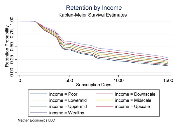
The highest income group has about 70 percent retention at 500 days following their subscription start, while the lowest income tier has about 50 percent retention. The temptation to conclude that income is the most important factor for predicting retention is compelling. This publisher could elect not to solicit subscriptions among low-income households as a result.
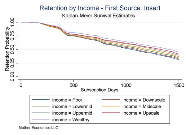
However, a plot of retention data by income group for starts from the insert channel in Graph 2 shows that differences in retention by income for this channel are relatively small. In this channel, the low-income group has about 75 percent retention at 500 days, higher than the wealthy income group in the first chart. The wealthy income group in this channel has about 80 percent retention at 500 days, a much smaller difference than the overall retention across income levels. This insight suggests that income does not have as much of an influence on retention as the first chart indicates, and that a chart of retention by income alone is not an accurate representation of the relationship between these two variables.
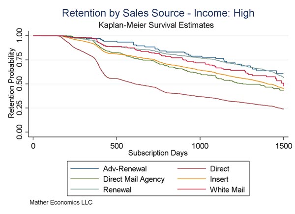
To further investigate the relative effects of income and channel on subscriber retention, we can plot retention curves for high-income subscribers acquired through different channels. In Graph 3, we see that high-income subscribers acquired through the direct channel have much lower retention than subscribers acquired in other channels. In addition, it is clear that the variation in retention by channel for high-income subscribers is at least as great as the variation in retention across income levels. This plot confirms that acquisition channel, in particular the direct channel, is an important determinant of retention in addition to household income.
Conclusion
Data visualization is a powerful tool that enables organizations to leverage data analytics to improve business operations. Just as increasing computing power enabled regression analysis to become widely adopted outside of academia and research organizations, data visualization has expanded the power of data across the economy. As with all tools, using it appropriately is important or the promise of the technology will not be realized. The cases described here provide an example of why an analyst using a visualization platform must be as careful and thorough as one using statistical regression to reach the correct conclusions about how variables affect one another.
Matt Lindsay, Ph.D., is president of Mather Economics, a global consulting firm that applies proprietary analytical tools and hands-on expertise to help businesses better understand customers and, in turn, develop and implement pricing strategies. Lindsay has more than 20 years of experience in helping businesses improve performance and drive revenue through economic modeling. He holds a doctorate in economics from the University of Georgia.