

September 9, 2018 in Five-Minute Analyst
California Climate
What does the data tell us about climate change based on three California cities over a long period of time?
SHARE: PRINT ARTICLE: https://doi.org/10.1287/LYTX.2018.05.14

This time on the Five-Minute Analyst, we take a look at climate data from three cities in California, our home state. A lot has been said about climate and data in the popular press over the past few years. We decided to take a look at three California cities – Bakersfield, Los Angeles and Fresno – over a long period of time (Figure 1). These cities were chosen because of their geographic diversity and length of record.
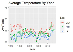
Observations on the Climate of California from Data
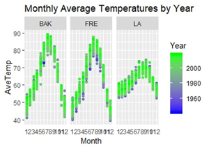
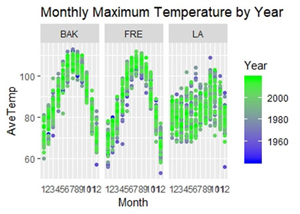
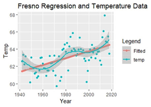
From these regressions, we see that there is only one case where the trend in temperature is upward without question: Fresno. In Fresno, the evidence that the temperature is rising at approximately .039 degrees per year is pretty resounding (p value 3.9 x 10⁻⁷) (Figure 4). Bakersfield’s regression shows a rate of .06 degrees per year (p-value of .027), which most practitioners still consider to be significant (against an ∝ of .05). In Los Angeles, there is not sufficient evidence (with a linear model) to support temperature rise with this data (p-value .15).
Conclusion
I hope that this little bit of data analysis will encourage our readers to think about this problem for themselves – specifically by obtaining their own data and repeating (or expanding upon) the work we do here. In the interests of scientific exploration, the code to this analysis is posted here. Given the upgrades in computing and availability of data, concerned citizens can simply do their own homework now and in the future.
Harrison Schramm, CAP, PStat, is a senior lecturer at Naval Postgraduate School, splitting his time between Defense Management and Operations Research where, in addition to teaching, he runs the Contested At-Sea Logistics Lab (CASLL). He served as the inaugural chair of the INFORMS Security Conference and is a past president of the INFORMS Analytics Society.
([email protected])