
January 7, 2019 in Five-Minute Analyst
Taylor’s Law and OEIS sequences
SHARE: PRINT ARTICLE: https://doi.org/10.1287/LYTX.2019.01.11

My neighbor, Peter, is a sculptor. We both work out of the back of our homes; Peter’s shop is parallel with my office, and on warm days, I will hear the grinding and sanding through my open back door. Over a beer a few nights ago, Peter asked me how much intuition, and, for lack of better words – “art” fell into what I did. I told him that while programming and handling data can be very mechanical, figuring out which questions are interesting to ask is, to me at least, very much an art. In that spirit, we proceed.
Recently, I was intrigued by a short article in American Statistician titled “Taylor’s Law Holds for Finite OEIS Integer Sequences and Binomial Coefficients” [1] (Demers, 2018). For those of you who might not be familiar, Taylor’s Law states empirically that for many data sets,

or that the mean and variance for certain processes are related exponentially. The current paper shows that this is true for a selected subset of the “Online Encyclopedia of Integer Sequences” (OEIS). In this short note, I’d like to explore two related questions:
- Is his true for more sequences than those tested here?
- Do similar results hold for higher order moments (i.e., skewness and kurtosis)?
These are the sorts of questions that I find interesting, because they are at the intersection of statistics and number theory.
Demers’ method was intentional; he selected sequences that fit certain criteria, among which are finiteness, “niceness” and non-negative mean. The last requirement is necessary for somewhat obvious reasons. Our method, in contrast, is broad and admittedly a bit ham-fisted. Initially, I was going to use the OEIS.R package (that’s a thing!) to iteratively download the sequences in order, but that grew tiresome. Instead, I downloaded the entire trove, current as of 10 a.m. Pacific Time on Dec. 7, 2018, in the “Compressed Versions” section.
Even for professional practitioners, this is a particularly unruly dataset; there are a total of 317,926 sequences of variable length. From here, we compute summary measures (if you are familiar with the apply() function in R, this is a plus) of length, mean, variance, kurtosis and skewness. I would recommend this data set to anyone currently teaching and looking for a “messy” bit of data for their students. This data is not messy because it is poorly curated, but rather because it is a matrix where the rows have dissimilar lengths, and because to be properly analyzed, it should be cast to “integer,” not “double,” which may eat up your computing power.
We repeat the linear regression as in Demers to determine the relationship between log mean and log variance. Without controlling for outliers, we get a very similar slope estimate (2.1 vs. 2.04) but dissimilar intercepts (-.4 vs .033). In Demers’ original study, he considered 110 sequences. In our analysis, we found a total 171,390 of 317,926 sequences that fell within 10 percent of the trendline (and many, many more that appear to be on trend with a wider interval).
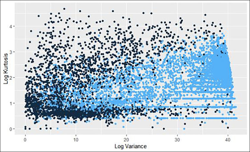
Figure 1: Plot of log mean and variance relationships in the OEIS database. The bright colored line represents those sequences for which the relationship is “close” to the result in Demers.
In addition to examining the result in the reference paper, we were also interested in seeing if there was a similar result for higher moments. Our efforts are, to this date, inconclusive. In the following plots (Figures 2-4), the light blue dots are those that are “on trend” for the mean and variance relationship above. The most interesting one compares Skewness (3rd Moment) with Kurtosis (4th) (Figure 2).
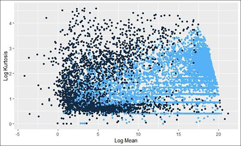 Figure 2: Plot of Log Skewness and Log Kurtosis. Note that the points that were identified as being “on trend” in the log mean/log variance plot are collected toward the leading edge of the “swoosh.”
For completeness, we offer the remaining plots of this data (Figures 3 and 4). It is interesting – but not particularly surprising – that the “on trend” datapoints from the log mean/log variance plot have similar groupings in the follow-on plots.
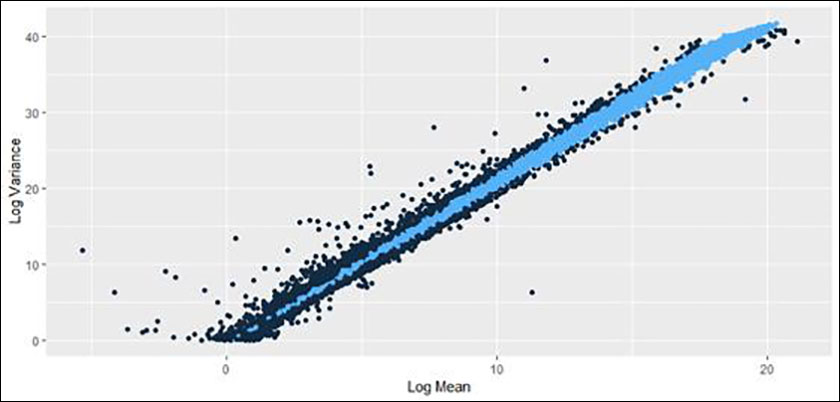
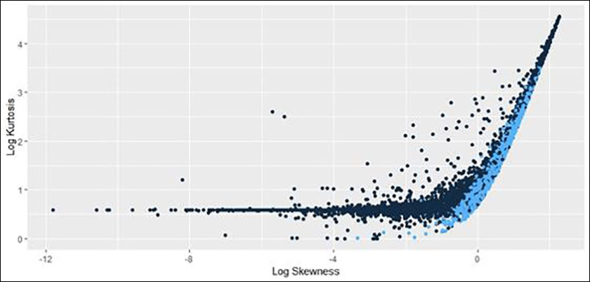
Figure 3 and 4: Two plots showing the relationship between mean and variance (X-axis) with Kurtosis (Y-axis). While these are “data clouds,” the sequences that were “on trend” in Figure 1 remain clustered together.
Conclusion
This was a fun diversion thinking about the properties of the OEIS and statistics in general. I encourage the study of interesting data sets, particularly when they are outside of our normal practice. As this is the “Five-Minute Analyst” and not the “Five-Year Dissertation,” I have not delved into deeper theory here. However, this might be fertile ground for a mathematician looking to make a mark.
Reference
Harrison Schramm, CAP, PStat, is a senior lecturer at Naval Postgraduate School, splitting his time between Defense Management and Operations Research where, in addition to teaching, he runs the Contested At-Sea Logistics Lab (CASLL). He served as the inaugural chair of the INFORMS Security Conference and is a past president of the INFORMS Analytics Society.
([email protected])