

June 19, 2019 in Five-Minute Analyst
Cycling and Power Curves
Despite skepticism in recent statistics literature, here’s a use case where regression totally worked.
SHARE: PRINT ARTICLE: https://doi.org/10.1287/LYTX.2019.04.05

A recent trend in the statistics literature considers changes in methodology such as ditching the “p-value,” moving toward explainable models and understanding all the various ways that standard methods – particularly regression – can go wrong. I realized this in a discussion with one of my junior colleagues the other day who said something to the effect of, “Regression – you told me that never works.” Additionally, there is a lot of interesting work going on in the field of data analysis for athletes, including our own SpORts (Section on OR in Sports) of INFORMS.
Here I’m going to talk about two things. First, a use case where regression – specifically regression on transformed variables – worked awesomely. Secondly, statisticians are fond of saying “correlation does not mean causality,” which is true, but sometimes it can be difficult to parse out which way an implication runs. So, with all of these warnings about the practice of statistics in mind, I’d like to talk about an application of regression that totally worked.
As longtime readers may know, I’ve been a cyclist for a long time, and I try to ride every day. About a year and a half ago, my coach, Ginger, suggested that I get a power meter, which is essentially a strain gauge that measures the flex in the crankarm [1] (the thing that connects the pedals to the chainrings) from pedaling. My immediate response was twofold: First was, “Dude, what a cool piece of tech.” My second response, which is the one I shared, was, “Only really fast people have power meters.” Now, there’s an implication there that’s worth unpacking.
My prior was to say that being fast causes someone to have a power meter, while my coach was of the opinion that the implication ran the opposite way – having a power meter makes one fast. I took her advice and bought a power meter, which meant I was now flush with data about bicycles, which is almost as good as peanut butter and chocolate.
Over the years, I have recorded my peak power vs. time (i.e., the most power I can produce during a cycling effort) as shown in Figure 1.
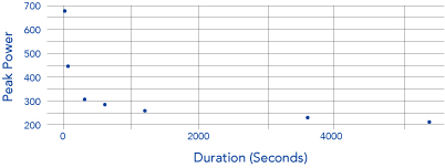
This data looks exponential, and it turns out that it is – doubly so. Let’s (re)consider this plot on a log-log scale (Figure 2).
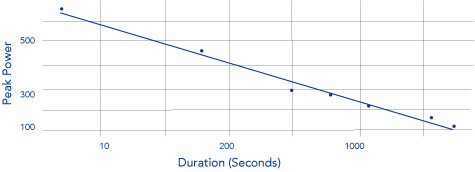
This data fits well – astonishingly well. In non-transform space, the regression produces an R-square greater than .99; in fact, it fits so well that if I had not collected the data myself, I might not have believed it.
It’s Not Useful Unless it has Predictive Power
Of the points on my personal “power curve,” the one with the largest residual – meaning the one that was most ripe for improvement – is the 300 second (five-minute) power. According to the data – assuming that the model is valid – I should have been able to produce 327 watts for five minutes. This is essentially a 10 percent improvement over my previous best, no small feat. When I put this to the test, literally, the actual number ended up being 322 watts, which is within tolerance.
Lingering question: I would be remiss in not noting the “feedback” between performance and predictions. If I had predicted a higher (or lower) number, would my performance have changed accordingly? This is an open question.
Note: For anyone who cares, I use a Stages brand power meter – left crankarm for Campagnolo Chorus, along with a Garmin Edge 520 cycling computer to record/report the data.
Harrison Schramm, CAP, PStat, is a senior lecturer at Naval Postgraduate School, splitting his time between Defense Management and Operations Research where, in addition to teaching, he runs the Contested At-Sea Logistics Lab (CASLL). He served as the inaugural chair of the INFORMS Security Conference and is a past president of the INFORMS Analytics Society.
([email protected])