

August 9, 2019 in Five-Minute Analyst
For California condors, love is in the air
SHARE: PRINT ARTICLE: https://doi.org/10.1287/LYTX.2019.05.05

I was recently on vacation in the Grand Canyon, and we saw several California condors in the wild. For those who don’t know the history of the California condor, they were nearly extinct in the wild before a captive breeding and reintroduction program was started in the early 1980s, with all surviving condors brought into captivity by 1987. The history of the condor re-introduction program can be found in full here.
Condors are still being bred in captivity. While at a talk given by the park rangers, we learned that there is publicly accessible data about the lives and pairings of California condors from the National Park Service in the form of the “Condor Gossip Chart.”
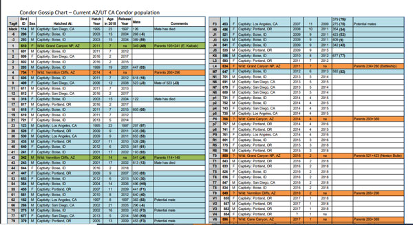
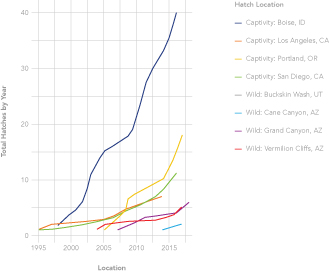
This chart can be downloaded as a .pdf and then rather quickly converted from that format back to a spreadsheet. From there, it can be brought into your favorite data analysis framework; in our case, R. As a preliminary to more advanced analysis, we can consider the hatches by sex per year, as well as the number of hatches by location (Figure 2).

Currently, the number of hatches from captivity far exceeds those in the wild. A plot of the cumulative hatches by year and location is shown in Figure 3.
Condor Romance
One interesting thing to do with the dataset is to link the condors by their mating pairs. As described by the park ranger, condors court by flying long distances together, wingtip to wingtip, to ensure their compatibility before building a nest.
In R, this can be done by segmenting the data into males and females, and then performing an “inner_join.” In Excel you would probably use VLookup() or similar. It would be possible to do this matching by hand, but not particularly scalable. From the 95 condors listed in the gossip page, 21 (42 condors, slightly less than half) are known to be in pairs.
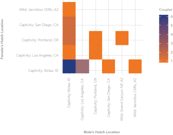
One interesting question to ask is: Do condors from a particular hatchery prefer their own “hometown sweethearts” or do they mix? We have data on where the condors are hatched, not where they are released or where they reside. Six condor couples (~30 percent) are Boise, Idaho, pairs. This is perhaps not surprising as more than 40 percent of the condors in the wild are from Boise (Figure 4).
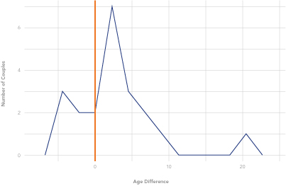
Finally, we consider the age difference between condors, which we have defined as the male’s age minus the female’s age. On average, the male is two years older, with a minimum of minus-five years (female five years older) and maximum of 20 years (Figure 5).
Conclusion
Wherever there is data, you should study the data. Even though this condor dataset is relatively small, it still has opportunities for interesting and insightful questions and analysis. This sort of problem is a perfect “practice” problem, particularly using languages such as R and Python, where the application to a dataset of thousands would be similar.
Harrison Schramm, CAP, PStat, is a senior lecturer at Naval Postgraduate School, splitting his time between Defense Management and Operations Research where, in addition to teaching, he runs the Contested At-Sea Logistics Lab (CASLL). He served as the inaugural chair of the INFORMS Security Conference and is a past president of the INFORMS Analytics Society.
([email protected])