March 31, 2020 in Coronavirus Chronicles
Competing COVID-19 Objectives
Reopen the economy and eliminate COVID-19 – lessons from wafer fabrication
SHARE: PRINT ARTICLE: https://doi.org/10.1287/LYTX.2020.02.19

Recently, government leaders and experts in economics and infectious disease have identified two critical objectives for the welfare of the nation: reopen the economy and eliminate or at least keep COVID-19 under control. Unfortunately, components of these two objectives have trade-offs. At one extreme a decision to fully reopen the economy is likely to create a surge in those seriously ill, overwhelming healthcare facilities. At the other, a decision to place everyone in complete isolation would reduce the ability of COVID-19 to spread but would eliminate most economic activity. Interestingly, the extreme for each case (no controls or complete isolation) results in no economic activity.
This situation is similar to the trade-off found in wafer fabrication (manufacturing). Wafers are the core component of all electronic devices and arguably the most complex manufacturing process in existence with 250-600 very precise manufacturing steps. The trade-off is between cycle time (time to make a wafer) and output or tool utilization and is represented by the operating curve (OPCURVE) where the cost for lower cycle time is less output and the cost for more output is higher cycle time for a given situation. The purpose of this article is to identify what we can learn from this OPCURVE experience in wafer fabrication with respects to “COVID risk strategies” – a term New York Gov. Andrew Cuomo used on March 25 at the end of his news conference with respect to making progress on both objectives simultaneously.
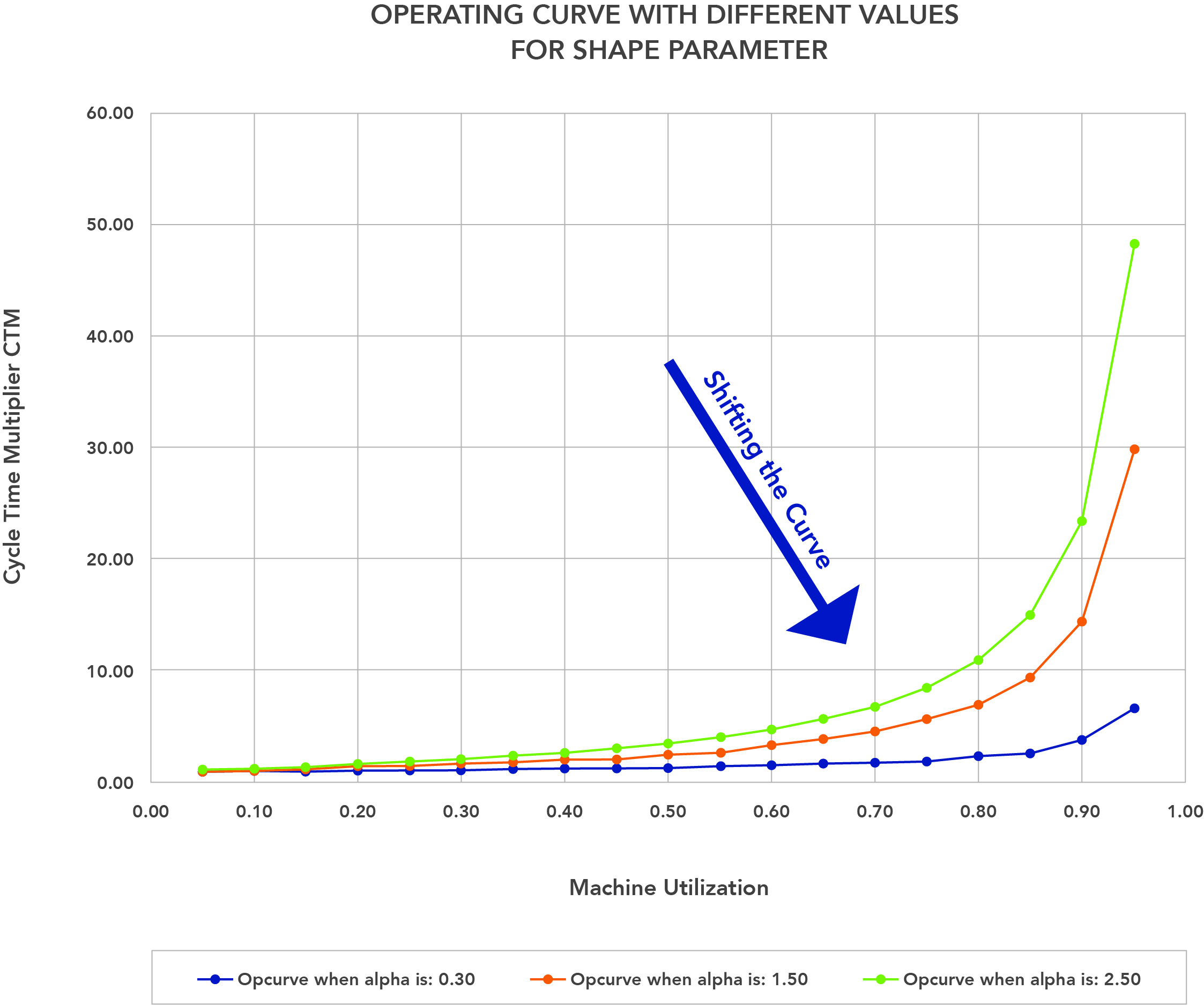
What is the Operating Curve?
When variability exists, either in arrivals or services, there is a trade-off between server (machines, people) utilization and the lead or cycle time to complete an activity or service. The higher the utilization, the longer the cycle time for a fixed amount of variability. The higher the server is utilized, the more total output over time. This is also referred to as the output and cycle-time trade-off. The curve (relationship) that describes this trade-off is called the Operating Curve (OPCURVE) and typically as tool utilization increases, the cycle time increases. Typically, the relationship is a monotonically increasing nonlinear function.
Cycle time is divided into two components: wait time and the actual or raw process time (RPT). Think about paying for your groceries at the local market. There are two components: waiting for the cashier to process your order and the actual checkout process. The time it takes to check out is the RPT. Often the RPT itself can be broken down into components. Cycle time is often measured as a cycle time multiplier (CTM), where total elapsed cycle time equals CTM times the raw process time (RPT). The machine utilization is typically measured as the fraction of time the tool is busy.
This relationship between cycle time and utilization applies to factories, banks, grocery stores, help desks, emergency rooms, CAT scans, etc. – there is no hiding from this trade-off. The OPCURVE often looks like a hockey stick. This relationship and the curve follow naturally from queueing theory equations as well as empirical observations. There are many forms of this function, both empirical and several nonlinear equations that capture this relationship. One of the simplest is:
CTM = offset + ∝(util/(1-util)), where:
- CTM is the cycle time multiplier
- Offset controls the minimum CTM when util is 0
- Util – machine utilization
- Alpha (α) is the shape parameter – the lower this value, the less variability in the system and the lower the CTM for the same utilization value. This is used to shift the curve, which is similar, but not identical to flattening the curve.
Figure 1 displays this curve for three different alphas (.5, 1, and 2) and captures the core concepts. Notice the lower the alpha value, the higher the utilization of the server before cycle time increases sharply. Observe when utilization is low, the curves are close together and look linear; we see the same pattern in exponential growth curves.
OPCURVE and Wafer Fabrication
The OPCURVE is now well accepted in most, if not all, wafer fabs (factories), and it is a standard part of any course on factory management (see “Factory Physics” by Wallace and Hopp, originally published in 1996). There was a time this trade-off was not well accepted, and many factory managers insisted utilization could be increased while not increasing cycle time (CTM) either as a natural law or simply by will power. In fact, eventually the lesson learned was both could be improved simultaneously by reducing variability, which meant being much smarter about planning schedule/dispatch of lots to tools in the wafer fab. This is called shifting the curve down and to the right (the arrow in Figure 1).
The details of how wafer fabs made additional use of “smarts” to shift the curve and improve performance is not relevant. The general concepts are:
- recognizing the OPCURVE and trade-offs are real, even though the data points look linear when utilization is low;
- great data infrastructure – relevant time data is critical, some may exist, some require putting in place systems to capture it;
- relevant time analytics for dispatch scheduling that handle the details;
- smart dispatch scheduling does not overcome insufficient capacity; and
- complex systems come from the interaction of simple components.
Some simple solutions and observations at first glance may appear reasonable, but a deeper dive demonstrates they are dangerous.
Lessons for COVID-19
The list in the previous paragraph applies to the COVID-19 challenge as is. Let’s look at some of them in detail.
COVID-19 models are projections forward using application structures and reasonable assumptions. There primary purpose is insight.
At this point everyone should recognize the “hockey stick” (exponential growth) effect is real – low levels early and then an explosion at some turning point. Denying its reality is a dangerous path.
What are the critical metrics? Although the number of COVID-19 positive cases is an obvious choice; the challenge is the number changes simply because of more testing (improved data collection). An alternative is the number of people who get seriously ill, all of which require medical attention and many require hospitalization.
Relevant time data infrastructure is critical and difficult to do. The right data in detail as it is needed. FABS take this for granted today, this was not true in the early 1980s where the best data came from an overnight batch job that created printed reports. Today we see folks scrambling to just gather the data needed (COVID-19 testing) and the state of each individual who is positive and capture into one location data that is already collected (admits to hospital, interactions with primary care physicians, number of beds, the location and control over all ventilators).
Smart scheduling will not overcome insufficient capacity: ventilators, masks, gloves, etc. Capacity cannot be added instantaneously without an act of God.
Simple solutions that sound rational at first look are a dangerous distraction from the real work that needs to be done.
An example is the comparison with road deaths. Yes, road deaths occur, and if no one had cars, there would not be any road deaths. However, road deaths do not grow exponentially with usage and are generally caused by specific actions of individuals as opposed to inadvertent interactions. We apply due diligence to reduce these actions with police enforcement and public policy (e.g., DWI). COVID-19 grows from inadvertent interactions that silently transmit the virus. Hence, social distancing to reduce the probability of those interactions.
A second example is “willing to die to save the economy for our children” [3], certainly a noble concept, but not well thought out – issues such as skill mix, physical strength, how long this older working population can stay healthy, impact on healthcare and where the demand is for the product.
Details matter. As we reopen the economy, what does it mean, activity by activity? For a restaurant, does this mean less tables to create more space and limit the size of lines? What about flying or time spent on a cruise ship?
Summing up, there is plenty of material being written and posted on the challenges, estimating the growth in COVID-19 incidences and thoughts about the economy. What can we pull from experiences in the trenches in shifting OPCURVE to provide some guidance on actions to help the nation achieve both critical goals?
Notes and References
- Fordyce, Ken, 2012, “The Semiconductor Supply Chain – Enterprise-Wide Planning Challenges” has the picture version of the complexity of this supply chain, https://arkieva.com/resources/books/.
- Milne, R.J., Wang, C.-T. and Zisgen, H., 2015, “Modeling and Integration of Planning, Scheduling, and Equipment Configuration in Semiconductor Manufacturing: Part I. Review of Successes and Opportunities,” International Journal of Industrial Engineering: Theory, Applications, and Practice, Vol. 22, No. 5, has more formal, but readable review with extended references.
- https://www.washingtonpost.com/nation/2020/03/25/coronavirus-glenn-beck-trump/
Ken Fordyce is the director of analytics without borders at Arkieva. He joined Arkieva in 2013 after completing a 36-year career with IBM covering a wide range of analytics applications from supply chain to colon cancer. Ken was lucky enough to be part of teams that altered the landscape of best practices in central planning, dispatch scheduling, artificial intelligence, applied optimization and data science. These teams received major awards from IBM, IBM customers, INFORMS, AAAI and POMS.