September 17, 2025 in IAAA Finalists
Using Innovative Analytics on Two Levels to Increase Vaccination Rates
SHARE: PRINT ARTICLE: https://doi.org/10.1287/LYTX.2025.04.09

Editor's note. This article is part of a series highlighting finalist projects and teams for the Innovative Applications in Analytics Award (IAAA), which recognizes the creative and innovative application of combined analytics techniques to create economic or social value. The INFORMS Analytics Society co-sponsors the IAAA competition at the INFORMS Analytics+ Conference every spring. If you are interested in having your IAAA submissions published in Analytics magazine, please contact Priya Sarathy and Raj Mahalingam through INFORMS Connect. For more about IAAA and the Analytics Society, click here.
The Challenge
By June 2021, thousands of people were dying per week in the United States because of the COVID-19 pandemic, as shown in Figure 1. It became clear that hundreds of thousands of people in the United States were dying because of the combination of the COVID-19 virus and misinformation. Pundits such as Fareed Zacharia were challenging U.S. , media and the political environment to more effectively support vaccination. Zacharia (pictured in Figure 1) said at the time, “What the vaccine giveth, politics taketh away” [1]. There was a growing realization that combating misinformation could be effective, including fact-checking interventions [2].


Figure 1: (a) The weekly number who died of COVID-19 in the United States provided by the World Health Organization and Our World in Data. (b) Photo of Fareed Zacharia by Sebastian Derungs (CC BY-SA 2.0).
What Social Outcomes Motivated the Work?
We wanted to save lives by sharing facts about the pandemic through advertising. Barro (2022) estimated that for every 124 people vaccinated, a life is saved [3]. Therefore, we believe that causing hundreds of thousands of people to become vaccinated could save thousands or even tens of thousands of lives. At the same time, it appears from the state websites that all major state-sponsored advertising campaigns had terminated before October 2021.
We were also dedicated (and continue to be dedicated) to increasing both data graph and internet literacy. We continue to do this by providing references to our facts that the person watching our advertisements can click on and encouraging them to “fact check us yourself.” Figure 2(a) shows a graph from one of our advertisements and (b) provides references and our invitation to the viewer to fact-check our ad.


Figure 2: (a) Graph of age by death probability and (b) our encouragement for fact-checking.
Our Analytics Approach
We identified a list of the 352 U.S. counties that had the lowest vaccination rates. We were concerned about the multiple types of demographic groups with different responses to our ads. Therefore, we randomly removed many of the counties from consideration for a potential second round of exposure. Also, we clustered the remaining counties through an optimization formulation, which balanced the goals of similar fractions of people of color and equal size. Then, we used optimization to select clusters to receive different combinations of advertisements and keywords to minimize the integrated variance using JMP and a candidate set approach. This permitted us to investigate interaction effects using ordinary least-squares regression.
The first (experimental) phase of advertising started in late October 2021 and ended in mid-December 2021. Our results did indicate an interaction effect between percentage of people of color and specific advertisements. It appears that Advertisement 2 had a negative effect on counties with high fractions of people of color (see the interaction effect shown in Figure 3(a)). This caused us to make a larger investment in a second phase of advertising in the locations shown in Figure 3(b). The second campaign started in late January 2022 and ended in mid-March 2022. We revised the advertisements for the second campaign because of the transition from the Delta to Omicron variants.
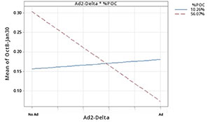

Figure 3: (a) Interaction plot indicates that Advertisement 2 had a positive effect on counties with low fractions of Black residents but a strong negative effect on clusters with high fractions of Black residents. (b) The states targeted in the second phase.
Outcomes and Impact
Looking back, we would have clustered the counties to respect state boundaries. Our models (not shown) find strong evidence of state effects that might relate to geographic contagion of information. We should have placed less emphasis on being able to fit a second-order regression model. Instead, more emphasis should have been placed on providing strong verifications of our own effectiveness. Amazingly, we have spent more money and time trying to estimate our effects than we spent on making and running the advertisements! This could pay off in future campaigns if we develop ways to better confirm effects while permitting some exploration.
Looking at the first vaccination history in Figure 4, the first campaign in Figure 1(a) likely had a major effect on the order of several percentage points, and the second campaign (after the transition to Omicron and to the mostly western states) had little effect. Additionally, either a third-party cause influenced both the treatment and control counties, or our campaigns had spillover effects (because they were interspersed throughout the states).


Figure 4: Time series plots show vaccination percentage increases for all counties in (a) Campaign 1 and (b) Campaign 2. The periods of the campaigns are shown on the x-axis. The results indicate periods of relative stability followed by major shifts starting during the campaign period in the vaccination rates.
Causal impact analysis, implemented through Google’s “CausalImpact” package, is used to estimate the effect of interventions, such as advertising campaigns, by comparing actual outcomes to a counterfactual scenario in which the intervention did not occur [4]. When we apply causal impact analysis to the treatment counties only for the first campaign, we find a significant effect, and approximately 24,592 people were caused to become vaccinated.
Next, we consider the possibility of a contagion effect of our campaign affecting others across the states having some of their counties in our target sets. Therefore, we studied the entire state population time series with the analyses summarized in Table 1. The results show significant “ripple” effects in several states. Such indirect effects are essential in public health campaigns because they can potentially magnify the impact of our interventions. Then, over 9 months, we would have caused approximately 0.4 million people to become vaccinated. Similarly, the difference-in-differences (DiD) method, which combines propensity scoring for matching and meta-analysis estimation [5], gives an estimated effect size of 0.20% for a horizon ending Jan. 15, 2022 (p-value = 0.84), and 1.5% for a horizon ending Sept. 7, 2022 (p-value = 0.04).
Table 1: Extended causal impact analysis (both short- and long-term impacts) to investigate contagion effects by Campaign 1 with highly significant p-values (“*” means less than 0.05). The results indicate as many as 0.4 million people were caused to become vaccinated.
| State |
Targeted Population |
Cutoff Date 1/15/22 |
Cutoff Date 9/7/22 |
||||||
| Sum % |
Avg % |
P-value |
Vaccinated |
Sum % |
Avg % |
P-value |
Vaccinated |
||
| North Dakota |
779,261 |
0.136 |
0.045 |
0.459 |
1,060 |
0.26 |
0.022 |
0.175 |
2,026 |
| Montana |
1,122,095 |
0.164 |
0.055 |
0.167 |
1,840 |
0.384 |
0.032 |
0.027* |
4,309 |
| Wyoming |
581,978 |
0.166 |
0.055 |
0.421 |
966 |
0.494 |
0.041 |
0.464 |
2,875 |
| Georgia |
10,931,805 |
0.142 |
0.047 |
0.432 |
15,523 |
0.854 |
0.071 |
0.243 |
93,357 |
| Missouri |
6,179,414 |
0.083 |
0.028 |
0.466 |
51,282 |
0.276 |
0.023 |
0.338 |
17,055 |
| Tennessee |
7,051,339 |
0.128 |
0.043 |
0.458 |
9,025 |
0.287 |
0.024 |
0.418 |
20,237 |
| West Virginia |
1,774,122 |
1.120 |
0.370 |
0.107 |
19,870 |
1.32 |
0.11 |
0.209 |
23,418 |
| Idaho |
1,944,299 |
0.100 |
0.033 |
0.467 |
1,944 |
0.233 |
0.019 |
0.457 |
4,530 |
| Indiana |
6,844,545 |
0.100 |
0.033 |
0.293 |
6,844 |
0.291 |
0.024 |
0.156 |
19,917 |
| Oklahoma |
4,026,229 |
0.120 |
0.040 |
0.387 |
4,831 |
0.409 |
0.034 |
0.176 |
16,467 |
| Arkansas |
3,045,637 |
0.053 |
0.211 |
0.010* |
1,614 |
0.382 |
0.032 |
0.035* |
11,634 |
| Louisiana |
4,650,000 |
0.088 |
0.029 |
0.301 |
4,092 |
0.24 |
0.02 |
0.304 |
11,160 |
| Total |
48,930,724 |
0.240 |
0.080 |
0.030 |
117,433 |
0.828 |
0.069 |
0.011 |
|
Future Research
We are currently working on public awareness campaigns relating to driver safety, likely focusing on the dangers of nighttime driving. We are planning our experiments to cluster counties geographically and honor state boundaries. We are also considering approaches to more carefully match ads to demographic groups while carefully checking the effectiveness through surveys. In addition, we are investigating productizing developing innovative, experimental planning and analysis methods so that other organizations can benefit from our lessons learned. In general, although we understand that there are problems with obtaining noncontroversial and true information, good-faith efforts like ours to share the best available information are important.
References
- Zacharia, F., 2021, “Fareed: There are anti-vaccine sentiments around the world, but few like America,” CNN, July 25, https://www.cnn.com/videos/world/2021/07/25/fareeds-take-anti-vaccination-sentiment-politics-gps-vpx.cnn.
- Porter, E. & Wood, T.J., 2021, “The global effectiveness of fact-checking: Evidence from simultaneous experiments in Argentina, Nigeria, South Africa, and the United Kingdom,” Proceedings of the National Academy of Sciences, Vol. 118, No. 37, Art. no. e2104235118.
- Barro, R.J., 2022, “Vaccination rates and COVID outcomes across US states,” Economics & Human Biology, Vol. 47, pp. 101201-101210.
- Brodersen, K. H., Gallusser, F., Koehler, J., Remy, N. & Scott, S. L., 2015, “Inferring causal impact using Bayesian structural time-series models,” The Annals of Applied Statistics, Vol. 9, No. 1, pp. 247-274.
- Stuart, E. A., Huskamp, H. A., Duckworth, K., Simmons, J., Song, Z., Chernew, M. E. & Barry, C. L., 2014, “Using propensity scores in difference-in-differences models to estimate the effects of a policy change,” Health Services and Outcomes Research Methodology, Vol. 14, pp. 166-182.
Theodore T. Allen, Ph.D., is the president and founder of FactSpread for this work. He also serves as a professor of integrated systems engineering at the Ohio State University and associate director for the Institute for Cybersecurity & Digital Trust. Long Wang, Ph.D., is a machine learning engineer at FactSpread. He graduated from Ohio State University with a Ph.D. in aerospace engineering. Antor Rashid is a part-time graduate research associate at the Ohio State University and part-time data system analyst for the state of Ohio.