

March 20, 2020 in Coronavirus Chronicles
Infection Reproductivity: Fizzle, Flash or Slow Burn?
SHARE: PRINT ARTICLE: https://doi.org/10.1287/LYTX.2020.02.17

(Information current as of noon EST, March 19)
Note: In response to the coronavirus, we have suspended our bimonthly “Five Minute Analyst” column and begun writing this occasional series. We intend to keep it up to date with public policies – and responsibly balance speed with quality – while being appropriately alarming without being alarmist.
We are, by all indications, at the beginning of an epidemic of worldwide proportions. The ultimate trajectory of that epidemic, at least in the United States, is dependent largely on both public policy and the actions of individuals. While the problem is complex and can depend on high-level mathematics, there are some straightforward, accessible ideas that can be thought about by the public at large. The intent of this series of articles is to make responsible mathematical commentary in a timely fashion. I do not intend to do this all by myself and am looking for serious collaborators to keep this going over the coming weeks.
We have previously taken a look at “flattening the curve” [1]. This time, we address a related but slightly different problem: how the effectiveness of measures to reduce the spread of infection will impact the ultimate trajectory of the disease and resulting impact on society. As grim as it may be to think about, we are still in the “early days” of the epidemic and do not have good estimates of how quickly the virus spreads and how long it lasts in situ [2]. In this piece, we are going to consider the basic reproduction number, Ro, and its consequences on the ultimate impact on infection.
We can think of Ro as the average number of new cases that each case generates. For example, if Ro = 2, then (on average) each infected person goes on to infect two additional persons. Many of the policies and measures taken to date can be clearly interpreted in this manner; for example, if we limit public gatherings [3] to less than 10 persons, then at most the number of follow-on cases from any given carrier is 9, but in reality it is probably much less.
While we aren’t able to make precise measurements (yet) of the parameters, we may certainly consider what sort of outcomes we will face based on differing values of Ro. For ease of discussion, we will even give them catchy names: fizzle, flash and slow burn.
Ro << 1: Fizzle
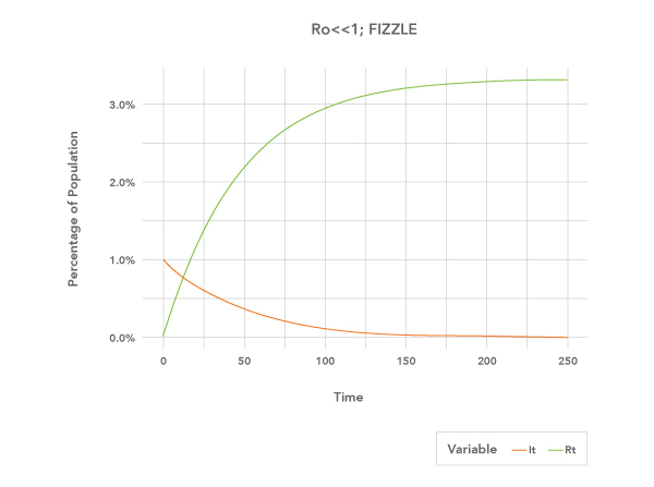
The first case that we consider is – by any objective measure – the best: where the relative reproduction rate is less than one. It should be a somewhat obvious conclusion that if each case on average generates fewer than one follow-on case, the infection will rapidly die out. That is shown in the time trace in Figure 1.
Ro >> 1: Flash
The second case we consider is one where the infection spreads rapidly. In this example at the beginning of infection, each case begets on average three follow-on cases. The impact is high – impacting nearly 95% of the population – but the duration is short.
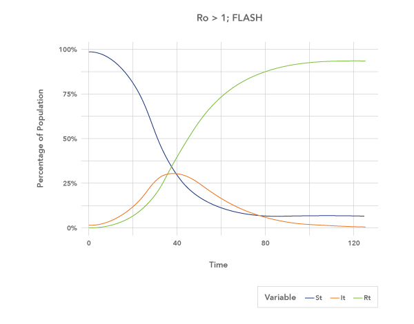
Figure 2: Flash. Here the infection moves quickly through the population but is also over quickly. Note that even under this high spreading sample, a substantial portion of the population is still becoming infected after the “peak” at day 37.
Ro = 1: Slow Burn
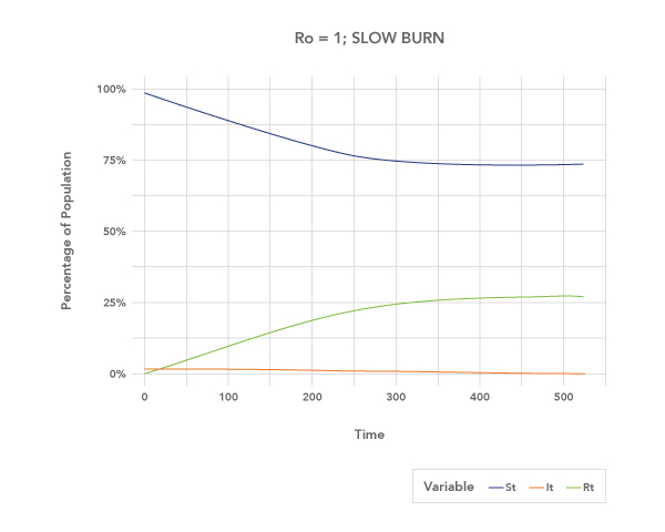
The third case under consideration here is the so-called “slow burn.” In this event, the infection never really takes hold, and the number of cases at any given time is “low.” Even in this case, “only” 25% of the population is affected, but the number of new cases does not stop until almost a year after the initial epidemic.
Note the different time scales on the three graphs.
These three graphs all have something in common: They all stink.
Are efforts to slow the spread working?
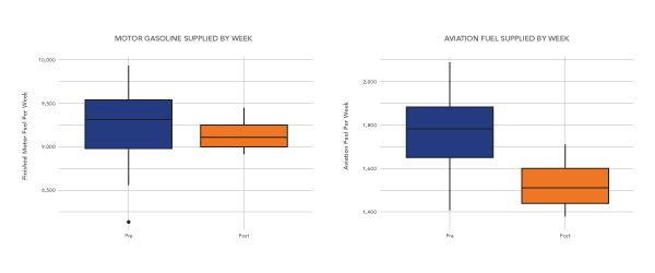
At this point, it is difficult to say. When we started writing this piece, our intention was to find near-real-time data from cities on items such as vehicle traffic intensity, light rail ridership or air passengers. This has proven surprisingly difficult to obtain. While we don’t have good data on how U.S. traveling habits have changed, we do have information on how fuel – both aviation and motor – is supplied from the U.S. Energy Information Agency [4]. It appears at first blush that vehicle fuel delivery is slightly depressed and aviation fuel delivery is significantly off trend. In the coming weeks, I hope to be able to look at how ridership and/or traffic patterns have changed.
When will we know we are “out of the woods”?
At press time, it is too early to tell. In the immediate future, there will be a temptation for policymakers to say that because the rate of new cases has dropped, that things are “getting better.” This is dangerous. Consider Figure 2: At the point of maximum infection, 37% of the population is unaffected, but by the end of the infection, less than 10% will remain so. In other words, when the infection “peaks,” it still has almost one-third of its work in front of it.
What about “herd immunity”?
Herd immunity is the notion that if everyone around me is removed from risk of infection – either due to vaccination or previous infection – then a susceptible person’s odds of coming into contact with an active carrier are very low, and the overall effect is similar to if they themselves were vaccinated. This is not the case at this time with coronavirus – trivially because there is no immunity yet resident in the “herd.” The only case where herd immunity is likely to develop is in the “flash” case, which is the one that also has the highest overall infection and hence, mortality. It is the case we are most actively avoiding.
Praying for time. Astute readers will note that there really isn’t any good news in this article. Humanity’s overall strategy at this moment is to stall the virus until effective treatment or cure is developed. Some estimates [5] have the (pooled) mortality of coronavirus to be .9% for people in my work peer group. Sounds low, right? I’ll leave you with this sobering thought:
|
Scenario |
Percent Impacted |
Deaths in my LinkedIn Network |
|
Fizzle |
3.5% |
<1 |
|
Flash |
95% |
12 |
|
Slow Burn |
26% |
About 3 |
References and Notes
- https://pubsonline.informs.org/do/10.1287/orms.2020.02.08/full/
- When we say this, what we mean is not that we mistrust our work, but rather that the numbers we arrive at are dependent on a variety of factors that are not controlled for. In short, we are not making a comment about the practice of statistics so much as the state of nature. When will we have better estimates? When there are more cases. It is frequently the case when working with “bad things” like diseases and vehicular mishaps that we would prefer to have poor quality data.
- We say “at most” because limiting the size of the gathering puts an upper bound on infection opportunity. Just because two persons are in the same space does not guarantee that the infection will be spread. In other words, handwashing still counts.
- https://www.eia.gov/dnav/pet/pet_cons_wpsup_k_w.htm
- https://www.worldometers.info/coronavirus/coronavirus-age-sex-demographics/
Harrison Schramm, CAP, PStat, is a senior lecturer at Naval Postgraduate School, splitting his time between Defense Management and Operations Research where, in addition to teaching, he runs the Contested At-Sea Logistics Lab (CASLL). He served as the inaugural chair of the INFORMS Security Conference and is a past president of the INFORMS Analytics Society.
([email protected])