An Interactive Spreadsheet Model for Teaching Classification Using Logistic Regression
Abstract
We present an interactive spreadsheet that supports teaching essential concepts in classification using the logistic regression (LoR) model for binary classification. The interactive spreadsheet demonstrates the capabilities of LoR by integrating computation with visualization. Students will reinforce concepts like probabilities, maximum likelihood estimation (MLE), and the use of likelihoods to optimize parameters for the LoR. We then discuss using LoR for classifications while adjusting its decision boundary (DB), demonstrating how to convert assigned likelihoods into classification using the DB; impact classification outcome by varying DBs; designate predictions as true positive, true negative, false positive, or false negative; and determine the classification accuracy. We use a variety of performance measures, including sensitivity, specificity, precision, negative predictive value, F1 and F2 scores, the receiver operating characteristics curve, and lift/decile charts. These measures are dynamically adjusted when the DB changes. We also reiterate the usage of these measures in the context of crossvalidation and imbalanced data sets. We provide a case study that implements LoR and an option for teaching the details behind MLE. We discuss the pedagogical aspects of this spreadsheet based on a survey of the 2022 student cohort in the Master of Management Analytics Program at the Rotman School of Management.
1. Introduction
Logistic regression (LoR) (see, e.g., chapter 4 in James et al. 2014) is one of the most popular classification techniques (other common techniques are linear discriminant analysis and K-nearest neighborhoods (KNNs)). Almost all textbooks related to statistical learning, data science, and business analytics cover LoR, typically as the first classification method. Therefore, LoR serves as the foundation for the comprehension of other classification techniques. We present an interactive and self-contained spreadsheet model that allows students to effectively grasp the statistical concepts related to the LoR classification model. We also use LoR as a vehicle for introducing other key concepts, such as the likelihood function and the maximum likelihood estimation (MLE) method for finding model parameters as well as common performance measures used for classification with balanced and imbalanced data.
LoR has been recently applied to (i) model the probability of a customer patronizing a firm among the existing firms as a function of the sum of travel time and queuing delay (Dan and Marcotte 2019), (ii) provide a real-time estimation of portfolio risk measures and classification of portfolio risk levels (Jiang et al. 2020), (iii) estimate the enrollment probability of each applicant in the Korea Advanced Institute of Science and Technology (Kim et al. 2019), (iv) assist in deciding whether to schedule a prostate cancer screening examination (Liberatore et al. 2009), and (v) teach students how to determine the relationship between point spreads and the probability of winning a game using data from the National Football League (Huggins et al. 2020). These applications of the LoR method demonstrate that this concept is not limited to a specific discipline, and its applications range from medical to business and engineering, among others.
Kopcso and Pachamanova (2018) present new ways to frame classroom discussion around the business value of models in data science, predictive analytics, and management science classes. They review predictive and prescriptive methods and how they map to business problems. In table 1 of Kopcso and Pachamanova. (2018), the authors establish correspondence between common business questions and analytics techniques. The authors propose LoR (among other techniques) to (i) “[d]etermine the impact of various factors on an output variable of interest,” (ii) “[a]ssign a score (e.g., likelihood, ranking) to an observation,” and (iii) “[c]lassify an observation (customer, loan, transaction, etc.) into a category.” We discuss these questions in Sections 4.3, 4.4, and 4.8, respectively. Those interested in integrating machine learning (predictive analytics) into operations research (prescriptive analytics) curriculum are referred to the paper by Boutilier and Chan (2023). Diamant (2023) presents an application-oriented course designed to familiarize MBA students with nontechnical backgrounds with tools from prescriptive and predictive analytics, utilizing Microsoft Excel and mathematical programming. The author demonstrates that students not only gain proficiency in data management and the creation of optimization and machine learning models but are also immersed in broader business concepts, initially perceived as more suitable for technically oriented professionals.
Finally, Nau (2019) developed an Excel add-in for linear and logistic regression that provides instructors with an excellent opportunity to cover many detailed aspects of regression over multiple lectures. Our interactive spreadsheet model is a stand-alone teaching supplement that can support teaching essential topics in logistic regression and classification.
Hoang and Watson (2022) propose an introductory business analytics course in which students are exposed to credit card application approval data with binary responses. The authors adopt a constructive-alignment approach1 to assess the ability of students in applying the logistic regression to a data set with the binary response variable. They used the Excel RegressItLogistic add-in (Nau 2019) to show (1) the differences between logistic and linear regression; (2) measuring of classification performance using accuracy, sensitivity, and specificity metrics; (3) out-of-sample testing; and (4) predicted probabilities.2
In another recent study, Brusco (2022) develops two Excel workbooks that explain (i) the maximum likelihood estimation problem when multiple predictors are involved, (ii) the process for testing the significance of LoR coefficients, (iii) different methods for model selection to avoid overfitting, and (iv) the measurement of relative predictor importance using all possible subsets. We include topics (i)3 and (iii) in the appendix and Sections 4.6 and 4.7, respectively.4 Despite the coverage of LoR with multiple predictors on a fairly large data set in Section 4.8, the primary scope of this paper is on the single-predictor LoR and its pedagogical aspects. The single-predictor LoR is better suited when the instructor aims to introduce fundamental topics, such as line-curve illustration, decision boundaries (DBs), and various measures and graphs for classification performance. Our work draws inspiration from the spreadsheet model developed by Erkut and Ingolfsson (2000) for simple regression. In their model, the authors developed spreadsheet models for teaching a simple regression model to students. The interactive spreadsheet model of Erkut and Ingolfsson (2000) shows students what error the linear regression minimizes. The authors used a square shape to illustrate the amount of squared error of each observation that emanates from the squared vertical distance of each observation and the fitted line. Huggins et al. (2020) developed a spreadsheet-based case study using real data from the National Football League to teach students how to establish the relationship between points spreads and the probability of winning a game by virtue of an LoR model. To tackle this case study, students require a combination of several key Microsoft Excel functions, including Pivot Tables, trend lines, and Solver.
Our spreadsheet model complements the works using interactive visualization, which is better suited for teaching business students. We provide an in-depth discussion and visualization of various performance measures for balanced and imbalanced classification problems (e.g., Fβ scores, negative predictive value (NPV), positive predictive value (PPV), decile/lift charts, receiving operating characteristics (ROC) curves, and area under the curve (AUC)), which are common in practice. In addition, we demonstrate some of the key issues in measuring classifier performance for balanced versus unbalanced data sets.
1.1. Summary of Contributions
The pedagogical and technical contributions of this paper are as follows.
We develop a spreadsheet model that allows instructors to interactively teach various basic aspects of classification to students in science, business, analytics, statistics, and engineering using LoR. Our spreadsheet model allows students to grasp key concepts of LoR by using built-in interactive features in our spreadsheet model and to acquire deep insights into how various components of an LoR model are interconnected. Our spreadsheet includes the following sheets: (a) read me, (b) data, (c) line curve, (d) likelihood (errors), (e) decision boundary, (f) performance measures, (g) model selection, (h) crossvalidation, (i) a case study, and (j) optional MLE explained. Although some of these subjects may be separately taught in different lectures (e.g., crossvalidation and MLE), our spreadsheet model provides an overarching bridge linking these subjects within a stand-alone lecture.5 We present the pedagogical highlights of each sheet in Section 4, where we explain them in greater detail.
Our spreadsheet model improves the interaction between students and the instructor and between students and the subject matter. Once the instructor covers the learning objectives and pedagogical highlights for each concept in each sheet, students can manipulate different cells in the spreadsheet model and observe how performance measures are impacted by changes in the nonlinear curve that is fitted to the data. We maintain that interactivity and visualization are very powerful pedagogical tools that can be used to (i) reinforce abstract concepts (like probabilities, likelihoods, and accuracy) and (ii) maximize students’ engagement, culminating in a firmer and lasting grasp of the LoR model and classification.
The case study spreadsheet allows instructors to summarize and reiterate the learning objective associated with previous sheets and teach students the LoR model with multiple predictors. Although we have instantiated this sheet with a specific imbalanced data set, instructors can use their own data set to teach LoR with multiple predictors. Plugging new data in this sheet will automatically calculate and generate relevant performance measures. In addition, this sheet enables instructors to easily assign different cases to students. Moreover, the case study sheet provides instructors with excellent pedagogical opportunities to interactively demonstrate (i) how the determination (and change) of the “training proportion” of the data set impacts the performance of the LoR model on both the training and test sets, (ii) how the “Excel Solver” is used to optimize the coefficients of the LoR model in the presence of multiple predictors and varying values of the training proportion, (iii) how changes of the DB impact the quality of classification, and (iv) which performance measures are best suited for imbalanced data sets. This sheet enables instructors to focus on the interplay among these parameters and demonstrate the back-and-forth nature associated with the effective calibration of an LoR model’s coefficients.
We organize this paper as follows. Section 2 of the manuscript explains students’ required background, the various lecture modules, their time allotments, and the associated pedagogical points. We present an overview of the linear regression in Section 3 and then, establish the relationship between linear and logistic regression. In Section 4, we further present pedagogical highlights of the concepts depicted on each sheet. In Section 5, we provide a concise overview of the feedback received from students regarding the spreadsheet model along with the corresponding statistical analysis of their evaluations. In Section 6, we present some concluding remarks and improving directions for our spreadsheet model derived from students’ feedback.
2. Time Allotment, Pedagogical Strategies, and Engagements
In this section, we outline the allocation of lecture time and the selection of different topics by the instructor to address the different components within our spreadsheet model. The lecture on this topic assumes prior knowledge of simple regression. In Table 1, we present a set of 10 modules and questions that should be posed for each module. We also present the suggested coverage time for each module. Of course, this list of modules and questions should not be regarded as an exhaustive road map for teaching the LoR. Instead, instructors can leverage the provided spreadsheet model to derive additional pedagogical insights tailored to the professional and academic backgrounds of their audience.
|

Table 1. Course Modules, Time Allotment, and Major Pedagogical Points
| Module | L1 | L2 | Time allotment | Major pedagogical points |
|---|---|---|---|---|
| (i) Data | ✓ | ✓ | 00:05 | What is the dependent variable? |
| What is the independent variable? | ||||
| What is the range of the dependent variable? | ||||
| How do you convert default status into zeros and ones? | ||||
| What is the percentage of defaulting customers to all customers? | ||||
| (ii) Line curve | ✓ | ✓ | 00:10 | What is the output of the linear and logistic regression models? |
| Do both linear and logistic regression models produce a linear relationship? | ||||
| Between the Linear Regression (LR) and LoR, which one would you choose for classification, and why? | ||||
| (iii) Likelihood | ✓ | ✓ | 00:25 | What are odds and their relationship to the probability? |
| What techniques are used to estimate the LR and LoR models’ parameters? | ||||
| What is a likelihood, and how is it different from probability? | ||||
| How is the concept of likelihood leveraged for classification purposes? | ||||
| (iv) Optional MLE | ✓ | 00:25 | What are “model parameters” in LoR? | |
| How can the likelihood be regarded as a function of model parameters? | ||||
| Why is minimizing the likelihood sensible? | ||||
| How do we find optimal LoR’s parameter values using the Excel Solver? | ||||
| How can MLE be applied to other models (e.g., the LR model)? | ||||
| (v) Decision boundary | ✓ | ✓ | 00:15 | How do you leverage the decision boundary to classify observations? |
| What must be the value of the decision boundary? | ||||
| What are the error types associated with an observation? | ||||
| What are the four categories of outcome for each observation after being classified? | ||||
| How does adjusting the DB impact the trade-off between FPs and FNs? | ||||
| How can we leverage Excel formulas to ascertain the classification status for each observation? | ||||
| What is the accuracy of a classifier, and how is it related to the classification status? | ||||
| (vi) Performance measures | ✓ | ✓ | 00:15 | Can you explain the confusion matrix? |
| Can you explain sensitivity, specificity, precision, NPV, and AUC? | ||||
| Can you explain the ROC curve? Why do we need the ROC curve? | ||||
| What trade-off does the ROC curve capture? | ||||
| What is the concordancy rate, and how is it related to the AUC in the ROC curve? | ||||
| What are the F1 and F2 scores, and when do we use them? | ||||
| What are the lift-decile charts, and when do we use them? | ||||
| (vii) Model selection | ✓ | ✓ | 00:15 | Which performance measures would you consider when choosing between a linear regression and logistic regression model? |
| (viii) Crossvalidation | ✓ | 00:25 | What are the in-sample and out-of-sample data sets? | |
| Between the in-sample data set and out-of-sample data set, which one is used for the calibration of the LoR parameters? | ||||
| What are the shortcomings of optimizing LoR parameters on a single data set? | ||||
| How do you determine the decision boundary when you have multiple data sets? | ||||
| (ix) Case study | ✓ | 00:20 | Is the data set used in the case study a balanced one? | |
| How do you leverage the Excel Solver to optimize parameter values of the LoR? | ||||
| How do you divide your data set into training and test data sets? | ||||
| How do optimize coefficients of LoR with multiple predictors? | ||||
| Which measures are more relevant to gauge the performance of the LoR model given the nature of the data set used? | ||||
| (x) Concluding remarks | ✓ | ✓ | 00:10 | The LoR model is the most widely used classification technique. What are some of the alternative techniques? |
| Total time | 85 | 85a |
Notes. L1 and L2 denote lectures 1 and 2, respectively. The checkmark in front of each module indicates whether the module is instructed in the first or second module. Italicized questions are the ones that must be emphasized and taught in the second lecture associated with LoR model.
aThe second lecture time allocation includes some time to review concepts from the first lecture.
Instructors should carefully consider the following questions before determining which of the lecture topics (modules) they wish to cover and the appropriate allocation of class time.
Is it desirable to provide instruction on the optimization technique, specifically the MLE, utilized for determining the optimal parameter values in the LoR model?
Is it intended to impart knowledge on crossvalidation techniques in the same lecture?
Should the classification of imbalanced data sets be included alongside balanced data sets?
Should LoR with multiple predictors be incorporated?
If the answer to all of the aforementioned questions is negative, a single 80- to 90-minute lecture would suffice, covering a subset of topics checkmarked under the L1 column in the table. In the event that the instructor decides to include all these topics, it would be necessary to conduct two lectures, each lasting 80–90 minutes.
We find that for students who have been previously exposed to the topics of classification, performance measures, model selection, etc. in the context of other statistical models, a single 85- to 90-minute lecture should suffice to cover a good selection of topics with proper pace, depth, and engagement. However, if students are exposed to the concept of classification for the first time, then two 80- to 90-minute lectures (a total of three hours of instruction time) should be allocated to cover all the sheets in our interactive spreadsheet.
As indicated earlier, all topics mentioned in Table 1 can be covered within three hours of instruction time. If the instructor decides to cover a subset of these topics, we suggest the following classification.
Lecture 1 is 90 minutes in length and should include topics (i)–(iii), (v), and (vi)—possibly excluding the highlighted questions.
Lecture 2 is 90 minutes in length and should include a review of lecture 1 and topics (iv) and (ix).
Note that the topic of crossvalidation has been briefly introduced in our spreadsheet to highlight the importance of robust parameter estimation. This is crucial to ensure the validity of the model’s results when applied to various untested data sets. We remark that for students with a higher level of proficiency in statistics, crossvalidation can be explored as a separate lecture, delving deeper into the subject. The subjects suggested for lecture 1 provide a foundational understanding for students who are new to classification using logistic regression, typically in an introductory statistics course. However, lecture 2 must be covered if students are pursuing analytics or specializing in classification as part of their MBA studies.
3. The Relationship Between Linear and Logistic Regression
We present the fundamentals of linear and logistic regressions and explain why the latter is more adequate for classification. We focus on a binary classification problem (classification to two classes) based upon a single predictor (i.e., univariate regression).
There are many applications where one is interested in knowing the relationship between a predictor and a qualitative response, including gender, nationality, eye color, employment status, etc. In such situations, the user wishes to classify objects into well-defined groups. In the context of such classification problems, it is natural to think of a probabilistic model that assigns a probability of belonging to a certain class to each data point. Focusing on classifications for two groups, we denote the two classes as class 0 and class 1 (i.e., the response variable Y can be either zero or one), and we look for a model that predicts the probability of Y = 1 for a given X (i.e., , where obviously, ).
3.1. Linear Regression for Prediction
We first discuss the potential problem of applying linear regression to a binary classification problem. Univariate linear regression uses the linear function
The slope of the model can be interpreted as the average amount of increase (or decrease if the sign of is negative) in the response variable Y as we increase the predictor variable, X, by one unit. The intercept can be interpreted as the value of Y when the predictor X is at zero value. Note that this model assumes that the response variable Y is quantitative, and the value of Y is obtained by setting the value of X = x, where x is a specific value of the predictor.
An important limitation of (1) is that it does not capture the probability assigned to each predictor value X directly. To illustrate this limitation, consider the following linear regression model for classification:
Observe that this model may produce p(X) > 1 or p(X) < 0. In Appendix A.1, we discuss this difficulty further and explain how it is being resolved when using logistic regression.
3.2. Logistic Regression for Classification
An alternative method for classification is LoR. In LoR, we use the following logistic function:
4. Interactive Spreadsheet Model for Classification
In the previous section, we provided basic concepts of linear and logistic regressions. In this section, we explain how our spreadsheet model allows students to interactively learn key concepts of classification and the usage of LoR model for classification.
Similar to the concept of error minimization in linear regression, the LoR model finds a nonlinear Sigmoid function that best fits the data using the concept of MLE. Our interactive spreadsheet helps visually reinforce the concept of MLE as it allows students to see how different parameters of the nonlinear function impact the value of the maximum likelihood.
The read me sheet is the first in our spreadsheet. In this sheet, we explain how instructors should teach each sheet of the spreadsheet model. This sheet also highlights crucial pedagogical points for the other sheets.
4.1. Data Sheet
In this data sheet, we provide a small data set that enables instructors to investigate various aspects of LoR. The data set table consists of data on 11 customers, their credit card balance used as the predictor, and the final binary outcome for these customers, which is the response variable we are trying to predict. Note that y = 0 if the customer is nondefaulting (the payment is made in full) and y = 1 if the customer is defaulting (no payment is made). Our data set and its plot are shown in Figure 1.

One pedagogical moment is to remind students that zeros and ones in the column “Default, y” are indeed “No default” or “Default” values that by using Excel function = IF(desired cell = “Default,”1,0), have been converted into zeros and ones, respectively. The other point is to remind students that the y axis ranges between zero and one for any observation of X, which is the credit card balance of customers. This basically indicates that any customer, regardless of his or her credit card balance, is either class 0 or class 1.
4.2. Line-Curve Sheet
This sheet includes two interactive figures that support classifications of our data using linear (Figure 2, center panel) and logistic (Figure 2, right panel) regressions. The bars on the left of these panels can be used to change the functions and observe their fit to data. The “optimize linear regression” button is used to show the optimal coefficients of the linear regression (i.e., the coefficients that minimize the sum of square errors of the linear regression). Observe that in contrast to the linear regression that leads to y values that are not necessarily between zero and one for some amounts of balance, the LoR leads to y values between zero and one for any amount of balance.

Assuming that students are familiar with linear regression, we first allow students to fit a straight line to data points by playing around with parameter values of the linear regression model (1) (intercept (β0) and slope (β1)) and interactively see how the line is fitted to the data. Students can press the button “optimize linear regression” to see the preoptimized values for parameters intercept β0 and slope β1.8 Having found these coefficients, students can observe that the linear regression line leads to probabilities outside of [0, 1] for some X inputs. The instructor can also let students know that Excel functions “Intercept” and “Slope”9 can be used to determine the values of β0 and β1, respectively.
One pedagogical highlight is that the instructor accentuates the optimized coefficients of the linear regression in the context of probability assignment. For instance, the instructor can draw students’ attention to the optimized β values ( and state that for X = 0 and X > 14, the optimized linear function produces and , respectively, none of which have a natural probabilistic interpretation). In fact, in the left panel of Figure 2, we can easily see that for some predictor X values, the response variable, , is outside the [0, 1] range that is required for a probabilistic interpretation. That is, if the function is to be truncated, there is a range of X values where changes in X make no difference to P(X). In contrast, under any β values, the logistic regression leads to prediction values that are in (0, 1) for any amount of the balance (see Figure 2, right panel).
After highlighting to students the differences between linear and logistic regressions, the instructor could manipulate the β coefficients of the logistic regression and ask students to do the same. This experimentation will help students develop a good understanding of what combination of LoR function’s parameters leads to a nonlinear curve fit that is closer to data points (see Figure 2, right panel). At this point, the instructor can highlight five pedagogical points regarding the LoR model.
For any values of β0, β1, and X, the logistic function (4) returns . The logistic function (4) gets extremely close to boundaries y = 0 and y = 1, but it never produces p(X) exactly equal to zero and one.
For any β values, the associated nonlinear curve will assign a probability of belonging to the “default” class to each customer with balance X = x, and these probabilities can be seen by hovering the mouse on top of the red curve line near each X in Figure 2, right panel.
Remind students that for the linear regression model, regardless of the value of X, if β1 is positive, then increasing X will increase p(X), and if β1 is negative, then increasing X will decrease p(X).
Coefficients of LR and LoR models must be carefully interpreted because each unit of x values (credit card balance) in our data is in hundreds of dollars instead of dollars. This indicates that as we increase x values by one dollar in the optimized LR model, the probability of default increases by .
If the material related to odds, described in Appendix A.2, is covered, further intuition on the LoR model and its interpretation with the odds ratio can be provided. For example, increasing X by $100 in our data will change log(odds) by β1 or equivalently, multiply the odds by . For example, when , the log(odds) increases by if we increase X by one dollar (i.e., the odds are multiplied by ). In the example, note that (i.e., a change of balance by $100 increases the odds by 12.8 times). Students can experiment with various balance amounts to see how this change of $100 impacts the probability of the default outcome.
4.3. Likelihood Sheet
In this sheet, depicted in Figure 3, students will learn (i) how the logistic function produces probabilities and likelihoods and how the likelihood is used to optimize the β0 and β1 parameters; (ii) how to differentiate between the concept of probability and likelihood; and (iii) the concept of maximum likelihood that results from the optimized nonlinear curve fitted to data points. This sheet allows students to learn about the objective of the LoR function and differentiate between ordinary least squares that minimize error in the linear regression and the MLE, which is a versatile technique that is applied here to the LoR model. The instructor can use this as an opportunity to introduce the concept of the likelihood as a function of model parameters that is defined by

For LoR, the term comes from the Bernoulli distribution that makes the MLE method particularly transparent.
This sheet allows students to interactively observe how choosing different parameter values impacts the MLE value, , as depicted by the blue bar in the stacked bar chart and to learn that ranges between zero and one, with lower values of indicating a poorer fit.
Given a data point X (e.g., credit card balance) and optimized parameters β0 and β1, the LoR model uses (4) to assign probability that observation X belongs to class 1 (e.g., defaulting customers) patients. (We use to denote the assigned probability p(X) to observation X given the optimized values of β0 and β1, denoted by and , respectively.) The likelihood of these observations being correct is the distance between this and . For example, the likelihood of a y = 1 observation is simply . In our data set, the largest credit card balance with X = 13 belongs to a defaulting customer (i.e., y = 1); so, under the optimal and parameters, the LoR classifies this customer as defaulting with probability , and the likelihood of this classification being correct is 0.9727, which is captured by the green line of length 0.9727 that corresponds to the rightmost point (X = 13) in Figure 3. Similarly, the likelihood of a y = 0 observation is . In our data set, the lowest credit card balance with X = 9.30 belongs to a nondefaulting customer (i.e., y = 0); so, under the optimal and parameters, the LoR classifies this customer as defaulting with probability , and the likelihood of this classification being correct is , which is captured by the vertical green line of length 0.9928 that corresponds to the leftmost point (X = 9.3) in Figure 3.
We can rewrite the likelihood of each observation X with associated probability as
Note that for a y = 1 observation, we can rewrite the likelihood using the formula included only in the first box: because the formula in the second box is one (the power will be zero). Similarly, Equation (5) captures the likelihood of a y = 0 observation in that the formula in the first box is one (the power is zero) and the formula in the second box is the likelihood. So, the likelihood of any observation, as given by the green lines, is mathematically captured by (5). Moreover, the likelihood of all observations is captured by multiplying their independent likelihoods as
There are multiple pedagogical points associated with this sheet:
Students learned that for any β0 and β1, the red S curve in Figure 3 produces probability for each credit card balance X to belong to the class of defaulting customers as in (4): . In the case of a perfect classification, the likelihood of each data point is one. For any other practical classifications, we wish to maximize this likelihood—getting it as close to one as possible for each data point.
This sheet provides an adjustable stacked bar that allows students to interactively see whether the new choice of LoR coefficients improves the quality of the fit, which is measured by ; higher values (blue color) indicate a better fit.
Students can press the “optimize logistic regression” button that would highlight the “optimal” on top of the LoR coefficients’ cells in red. Once the button is pressed, formula , β1) yields the MLE value.
The sheet explains the probability and likelihood measures and provides their mathematical formulas. For example, the formula for the calculation of the likelihood of each point is provided in (5); therefore, given the optimal LoR model with and , a data point X = 11.55, and y = 0, we obtain the probability of 0.4694 () and a likelihood of 0.5306.
Because LoR models calculate the probability of an observation belonging to class y = 1, higher values of for an observation with y = 1 in our data set indicate a higher likelihood (i.e., a better fit of the LoR model). Similar logic holds for lower for observations y = 0.
The objective function of the MLE, , is to maximize the product of the likelihood values for all observations. Moreover, as is a product function of factors smaller than one, it is decreasing with the number of observations.
If the LoR model is presented in a three-hour lecture (two lectures that are 90 minutes in length), the instructor can teach the sheet “MLE explained” presented in the appendix. This sheet develops an in-depth understanding of the method behind optimizing the coefficients of an LoR model (i.e., MLE) and is a suitable topic for technical students in engineering, science, and analytics.
4.4. Decision Boundary Sheet
Having found the optimized parameter values for the LoR model, one can use its output (probabilities) for classification. As we earlier stated, LoR assigns a probability of belonging to class 1 (i.e., the customer is a defaulting one) to each observation. However, to convert these probabilities to decisions (i.e., a prediction of which class a given observation belongs to), we need to specify the DB, a value between zero and one, such that an observation is classified as one if and zero if . Although the value of DB = 0.5 is commonly used (i.e., classify an observation as one if its probability is over 50%), there is no reason why DB must be set to this value; moreover, in imbalanced data sets where ones are rare, using DB = 0.5 may not be optimal. The current sheet allows students to practice the concept of DB and distinguish it from probabilities estimated by the model.
In this sheet, we depict the DB as a horizontal black line superimposed on the optimized fitted LoR line. Students can change DB and dynamically observe how the classification of observations changes because of the new value (see Figure 4). For instance, if DB = 0.5 (which is the default DB for classification) and the probability of a data point is 0.4694 (the probability of the first data point), we classify that data point as a “nondefaulting” customer (i.e., we assign value 0 to this data point).

Under the column “Correct class?,” students can see whether the predicted class is correct for each data point (true) or not (false). Based on this comparison, we determine the accuracy of our classifier, the LoR model. The accuracy of a classifier is defined as the fraction of the total number of correctly classified data points divided by the number of all data points, which in our case is
The value of accuracy is calculated in column M and is also illustrated in a stacked bar chart that is dynamically adjusted based on the DB.10
In this sheet, we further introduce students to some of the key terms of classification: true positive (TP; the correct classification of a positive observation), true negative (TN; the correct classification of a negative observation), false positive (FP; also known as type 1 error—the false classification of a negative observation as a positive one), and false negative (FN; also known as type 2 error—the false classification of a positive observation as a negative one). We let the total number of data points classified as true positive, true negative, false positive, and false negative be denoted by TTP, TTN, TFP, and TFN, respectively. Then, the accuracy is defined as follows:
The instructor can now set DB = 0.7. The highlighted cell in Figure 5 shows the data point that its class has changed because of new values of the DB.

A summary of pedagogical highlights for this spreadsheet is as follows.
Explain that the “DB” dictates the assignment of each customer into zero and one (i.e., nondefaulting and defaulting customers, respectively). Different DBs yield different accuracy values for the LoR model.
Emphasize that the classification is performed based on probabilities and not likelihoods. The assignment of each observation is done by comparing the probability of observation with the DB value. Observations with a (strictly) higher probability than DB are assigned as one, and other observations are assigned as zero.
Note that the DB does not impact probabilities in any ways and that probabilities are only determined by the LoR model coefficients and . Thus, the DB is a value that is determined postmortem by the decision maker, and hence, it is not optimized by the MLE method.
Higher values of DB lead to fewer customers being classified as positives (fewer customers being classified as defaulting) and more observations being classified as negatives (more customers are classified as “nondefaulting” ones). Thus, the choice of the DB depends on the trade-off between different performances of the classification. The instructor may want to note that the accuracy measure (8) weighs all errors equally (i.e., TFP and TFN have the same effect on the measure). However, weighing all errors equally may not be a good choice in many applications (e.g., we may care more about classifying a risky customer as “nondefaulting,” an FN, versus classifying a nondefaulting customer as “defaulting,” an FP). This is further discussed in the next sections.
The instructor can encourage students to play with all DB values and highlight that no DB value can yield an accuracy of one, indicating the existence of discordant pairs, which is discussed in subsequent sections (see Figure 7).
4.5. Measuring Classifier Performance
This sheet transcends the LoR model and is applicable to any classification technique. We use it to measure classifier performance. We include both summary measures, where a single number is used, and graphical measures, which visually present (i) trade-offs between sensitivity and specificity as defined as well as (ii) classification accuracy in different regions of the data. We also comment on the extent to which each measure is susceptible to being affected by sample imbalance.
4.5.1. Summary Performance Measures.
These measures assess the accuracy of a classification procedure using a single number. The obvious trade-off is the convenience of having a single well-defined performance measure versus the impossibility of summarizing various trade-offs involved in classification with a single number. These trade-offs are generally of two types.
Classification accuracy for some types of observations may be more relevant than for others. For example, if the goal of the model is to identify customers who are at the highest risk of default, then we mostly care about the model accuracy for the top-risk customers, whereas the model accuracy for the low-risk group is less important.
Classification errors are either FPs and FNs, and a classification rule usually involves some implicit trade-off between these two. This very important trade-off cannot be captured in a single-number summary.
The combined summary measures output is presented in Figure 6, which can be used by the instructor to interactively teach some of the most commonly used performance measures for classification.

After reminding students of the TTP, TFP, TTN, and TFN concepts, whose values are summarized in the confusion matrix output, the instructor should discuss how various measures are constructed from these concepts and how they are influenced by the DB. This sheet allows students to explore the impact of various values on the different performance measures of an LoR model. The discussion should start by recalling the definition of accuracy, defined in Equation (8) as the percentage of correctly identified observations. The values of other measures and their brief definitions are presented right below the confusion matrix. Because all measures can also be interpreted as percentages, their values are summarized on the bar chart in the right panel.
4.5.2. Recall, Specificity, and Related Measures.
We first discuss two very popular measures: recall (also known as sensitivity) and specificity. The formula for recall is
The flip side of sensitivity is specificity; although the former measures how worried we should be if the model predicts a “default” result, the latter measures how safe we should feel if the model prediction is “no default.” The formula for specificity is
Close relatives of recall and specificity are the PPVs and the NPVs. The former, also known as precision, answers the following question. Given that the classification model indicates that a customer belongs to a “default” class, what is the probability that the customer has actually defaulted on his or her payments?
Mathematically, the definition is
A similar performance measure is the NPV:
It is instructive to compare the differences between PPV and recall as well as NPV and specificity. Suppose a model only classifies one customer as “default” and that it does so correctly (in our case, this happens if we set DB = 0.95). Then, PPV is 100%. However, given that there are five customers with “default” status and the model classified only one of them correctly, it misclassified the other four, creating four TFN outcomes. Therefore, the recall (sensitivity) is only . Thus, when the model identifies a customer as a “defaulting” one, we can be sure that it is correct; however, most “defaulting customers” are missed.
Similarly, we can have a situation where only one observation is classified as zero (if DB = 0.009 in our case). Assuming that this classification is correct, NPV = 100%, but specificity because there are six “nondefaulting” customers who are misclassified. This discussion also indicated that all four measures are strongly affected by DB.
By setting DB to a very high value (close to one), nearly all observations will be classified as “zero.” This will result in a very high specificity (if nearly everything is classified as a “zero,” an FP error is impossible) and also drive up the precision (hopefully, the observations with the highest p(X) are identified correctly, so FP should be low). The price of having a high DB is low values of recall and NPV.
Conversely, by setting DB to a low value (close to zero), nearly all observations are classified as “one.” This will result in a very high recall (no FN errors) and NPV but very low specificity and precision.
Accuracy attempts to balance between these two extremes; indeed, it can be shown that accuracy is maximized at DB = 0.5. However, there is no flexibility in this measure. Sometimes, we may want to put the higher value of recall versus sensitivity and vice versa. The F1 and F2 scores introduced provide such sensitivity.
4.5.3. Fβ Score: Flexible Measure.
We introduce a class of measures that allow for explicit trade-offs between recall and precision, effectively allowing the user to specify the relative importance of FN and FP errors. The Fβ score for a given β is defined as
Pedagogical points for the Fβ score include the following.
The Fβ score provides the decision maker with the flexibility of considering different weights for recall and specificity.
A β value below (above) one assigns a higher (lower) weight to the precision than to the recall.
The most common values for β are one and two, resulting in the popular F1 and F2 scores, both of which are calculated in our sheet.
The F1 score is the harmonic mean of the precision and recall scores, and it is used as a metric when the cost of an FP or FN error is the same. It can be seen as an alternative (a close relative) of the accuracy measure.
F2 score is used when the weight of recall is twice that of precision.
The instructor can compare the F1 scores of DB = 0.5 and DB = 0.6, which are 0.80 and 0.89, respectively. The improvement in the F1 score under DB = 0.6 is attributed to the increase of the precision value 1.00 (because of the elimination of an FP).
The instructor can finally state that if maximizing the F1 score is the goal of the classification, DB = 0.6 (or 0.7 or 0.1) provides the highest F1 score equal to 0.89. DB = 0.6 (or 0.7) coincidentally yields the highest accuracy value of 0.91; F2 score is also maximized at this level. Instructors must mention that it rarely is the case that one DB concurrently maximizes the F1 score, F2 score, and accuracy performance measures. Typically, these measures are maximized at different DB levels.
4.5.4. AUC: Decision Boundary-Independent Measure.
All performance measures defined so far depend on both the intrinsic accuracy of the model and the value of the DB. In this section, we introduce AUC, which measures the intrinsic accuracy of the model.
“AUC” is an acronym for the area under the curve, and it is usually defined as the area under the ROC curve—one of the graphical measures described. Although this definition is correct, it is not intuitive. We prefer a mathematically equivalent definition of AUC as the concordancy rate, which is based on using the model to rank the relative risk of “zero” and “one” outcomes.
Consider a pair of customers i and j, where Yi = 0 and another Yj = 1. We would like the probabilities p(x) produced by our model to be correctly ordered (i.e., ), indicating that the model correctly recognized customer j as being riskier than customer i. If this is the case, we call the (i, j) pair concordant. If on the other hand, , the pair is discordant. In case , the pair is tied.
For example, consider the pair of the fourth and fifth customers in Figure 7 (who have different Y values). Because their X values are 10.70 and 12.6, respectively, we see that , and thus, this is a concordant pair. In contrast, the pair of customers 6 and 7 is discordant (the X values are 11.1 and 11.7 with , but their Y values are zero and one, respectively).
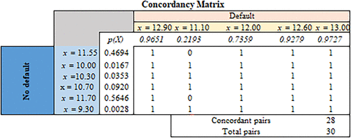
Notes. The rows are all observations belonging to class 0 (nondefaulting customers), whereas the columns are all observations belonging to class 1 (defaulting customers). If p(x) for the column is greater than p(x) for the row, the cell value is one, signifying a concordant pair. Otherwise, the value is zero (tied or discordant pair).
The concordancy rate, which is mathematically equivalent to AUC, is simply the proportion of concordant pairs among all possible pairs of observations with different Y values. The computation, illustrated in Figure 7, is displayed on the “performance measures” sheet to the right of the bar chart. In our example, there are 30 pairs, of which 28 are concordant, leading to (see Figure 8).

The key pedagogical observation is that this computation is completely devoid of any references to the DB. Indeed, students can observe that changing the value of DB affects all other summary performance measures but does not affect the AUC. The value AUC = 0.933 reflects the intrinsic accuracy of the model; presented with two customers of different classes, one with default status and one with nondefault status, the model will correctly identify the former as riskier 0.933 of the time.
4.5.5. Performance Measures for Imbalanced Data Sets.
Students have thus far learned how to find an appropriate value for the DB using the performance measures discussed. These performance measures are often sufficient when data are balanced. However, these measures may be misleading for applications with inherently imbalanced data (i.e., when either the “one” or “zero” class has a much smaller representation than the other class).
There are abundant examples of imbalanced data sets. For example, consider the task of identifying phishing emails (designated with response value 1) among likely far more numerous harmless emails (designated with response value 0). Another common example occurs when one is interested in predicting customers’ monthly churn (i.e., identify customers who are likely to cancel their service). In both examples, there will be a strong imbalance between class 1 and class 0, with the former comprising perhaps 1% or less of the data.
There are three key problems induced by highly imbalanced data sets.
Accuracy can be gamed. Consider setting the DB to some high level where all observations are classified as “zero” (recall that p(X) < 1, and thus, for a DB value sufficiently close to one, all observations will indeed be classified as “zero”). Suppose that of the data belongs to class “1” and belongs to class “0.” In this case, our TTN equals (because we classified all observations as “zero,” which must include all real zeros), and TTP . From (8), we see that accuracy . For example, if class “0” constitutes 99% of the data, then accuracy = 99%. It is very hard for a model to beat this value. Worse, this value was achieved without any model at all—just by applying a simple and useless decision rule because it classifies all emails as “harmless” or all customers as “nonchurn.”
Although the situation may seem contrived, it is, in fact, very common. Continuing with the previous example, if the data set consists of 99% “zero” class, then the baseline rate of observing a “one” is 1%. Suppose our model manages to predict the risk of a “one” at 20 times the baseline rate (as discussed in relation to graphical tools, this would often be considered an excellent level of accuracy). This would mean that when X is the value of the predictor for the “one” class. With a typical DB value of 0.5 (used as the default value by many statistical packages), the predicted class for all such observations is “zero.” Thus, we are back to the previous case; the model classifies all observations as “zero,” achieving a very high accuracy rate with a practically useless decision rule.
The goal of modeling in imbalanced settings is often to identify a relatively small subset of high-risk observations that will be acted on. For instance, in the case of phishing emails, we may want to flag any email whose risk of being of phishing type exceeds 10 times the baseline rate. Similarly, predictive churn modeling seeks to identify customers whose churn risk is much higher than average so that they can be designated for special retention efforts. In both cases, we want the model to be accurate for the selected group; the model’s performance outside of this group is not of interest. Thus, we need a flexible measure that would allow us to evaluate the model’s performance depending on the size of the selected subset. This flexibility is provided by the graphical performance measures described.
We note that a common approach to working with severely unbalanced data sets is to rebalance the data (e.g., with over- or undersampling). Although such techniques are outside the scope of this paper, they do come at a price because data rows are either removed or artificially added to the data set. Thus, as mentioned in Developers Google (2022), if one can develop a well-performing model without reverting to these techniques, it is the preferred approach.
4.5.6. Graphical Measures of Classifier Performance.
We introduce three related and popular graphical tools for measuring classifier performance: cumulative lift chart, decile-wise lift charts, and ROC chart. As with the summary measures introduced earlier, these tools are applicable to any classification context, not just the LoR model.
All three tools share the following common features.
They allow the decision maker to focus on the highest-risk group and evaluate the model’s performance within this group.
They compare this performance with the baseline random classifier that assigns observations to classes randomly according to the class prevalence in the data set. For instance, if the data set consists of of class “1” and of class “0” (for concreteness, think of ), then the random classifier assigns each observation to class “1” with probability p and to class “0” with probability . This would be a reasonable assignment if no information was available about each observation (i.e., if we did not know the value of the predictor X). Because classification models use X, it is quite sensible to ask how much better our model performs versus the random classifier.
The charts are independent of the DB and work very well even with highly imbalanced data.
To construct these charts, we first sort all observations in descending order of the probabilities p(X) of the classification (in our case, based on the LoR) model.
For the cumulative lift chart, the sorted observations form the x axis, whereas the y axis is the cumulative number of ones. The result is illustrated in the table in Figure 12 just above the chart (plotted as a solid red line). The interpretation is that if we use the model to identify n riskiest observations in our data set, the line tells us how many ones would be captured in this group. In our example, the group of the five riskiest observations would contain four total ones.
The dashed red line in Figure 13 plots the expected performance of the random classifier. In a data set with N observations and a proportion of of ones, a subset consisting of n observations is expected to contain observations of class “1.” Thus, the cumulative performance of a random classifier is represented by a line through the origin with slope . Comparing the y values for both lines at a given x value tells us how well our model performs compared with the random classifier for the x riskiest observations. In our example, because , a random selection of five observations is expected to contain 2.27 ones versus 4 ones if the same set is selected by our model. The lift of the model is the ratio of these values: . Generally, the lift falls as the size of the selected group increases (if all 11 observations are selected, the lift is one; if we would act on all patients, there is no advantage to using the model).
The decile-wise lift chart presents similar information in a slightly different way. In order to construct this chart, we divide the sorted observations and data into 10 equal-sized groups (deciles), labeled from 1 to 10, on the x axis.
Next, we calculate the model lift within each decile. The lift is the ratio of our model’s accuracy in identifying ones versus that of the random classifier. For the latter, the expected proportion of ones within any decile is just . For the model, we can compute two measures: the predicted proportion, equal to the mean of the p(X) values within each decile, and the actual proportion, equal to the proportion of ones within each decile. This leads to the following formulas:
Note that and are the mean of the LoR model’s predicted probabilities for each decile and the expected response value of one for each decile, respectively. Additionally,
Note that and are the mean of observations with a response value of one for each decile and the expected response value of one for each decile, respectively.
The decile-wise lift chart, in Figure 13, depicts both lifts for each decile; the details are presented in the table above the chart.
There are three things we want to see on the decile-wise lift chart for a good model.
A good agreement between actual and predicted bars for each decile. This indicates that the probabilities p(X) predicted by the model are accurate.
A sharp decline of lift values as we move from lower to higher deciles. This decline indicates the model’s ability to confine the riskiest observations to just a few deciles, whereas the remaining observations can be viewed as safe.
A high lift value in the top decile (in many industrial applications, lift values of around four in the top decile are considered a hallmark of a good model).
The lift charts are based on the same idea; suppose that, after ranking observations by decreasing predicted probability value, we select the top k% of observations as our action group. Assuming that the model is reasonably accurate and that k is small (e.g., k is the first decile, or in our example, it consists of the first two observations), the resulting group will contain mostly ones and very few zeroes. Thus, if we classify all observations within the group as “one” and those outside this group as “zero,” we will be making very few FP errors but possibly many FN errors because many ones will fall outside this group when k is small. In other words, we will achieve high specificity and perhaps, low recall (sensitivity). As we expand the group by letting k grow, our sensitivity will increase (we are capturing more ones), but specificity falls (we are including more zeroes in the group and classifying them as “one”). Eventually, when , recall reaches 100%, and specificity falls to zero. Any value of k thus represents a trade-off between recall and specificity. This trade-off is plotted explicitly on the ROC curve—our last graphical measure except that the x axis represents 1 − specificity. The curve always starts at (0, 0) (when , we have no FP errors and 100% FN) and ends at (1, 1) (corresponding to , which does the opposite). The ultimate model, which classifies every observation correctly, would get us to (1, 0), having perfect recall and specificity, and the ROC curve would look like the right angle. The closer the ROC model comes to this ideal, the better the model. In fact, the alternate (and more common) interpretation of AUC is “area under the ROC curve,” with AUC = 1 representing the perfect model (we believe that the earlier interpretation of AUC as the concordancy rate is more intuitive). Finally, a random classifier has the ROC curve represented by the 45° line from (0, 0) to (1, 1).
We also note that any value of the DB corresponds to some k in the previous paragraph and thus, can be plotted on the ROC curve. This is represented by the blue dot on our worksheet; as the DB changes, the dot moves, allowing students to read off the recall-specificity trade-off represented by this DB (note that in our example, the performance of the classification is identical for DB = 0.6 and DB = 0.7).
The important pedagogical moments for the three charts are as follows.
The lift/decile/ROC charts are often used for imbalanced data sets when other standard accuracy models may be less informative.
These charts allow us to identify an “action group” and evaluate the trade-offs associated with the size of the selected group.
These charts are commonly used in the context of model selection (particularly the ROC chart and the associated AUC measure).
4.6. Model Selection Sheet
Now that students are familiar with different classification performance measures, we can discuss model selection. Model selection is an important part of any analytical model. There are alternative methods to perform model selection. For example, Brusco (2022) offers a valuable pedagogical resource for choosing predictors using “lasso” and “all best subsets” approaches. We limit our model selection to two basic models: linear regression and LoR. This restriction emphasizes the conceptual and structural shortcomings of linear regression for classification purposes. This comparison is depicted in Figure 8.12
Students learned earlier that linear regression may produce output or p(X) > 1, rendering it unsuitable for use as a probabilistic model. Nevertheless, linear regression can be changed into a probabilistic model, as required for classification. Specifically, we change the output of a linear regression, p(X), as follows:
round up to zero if ;
do nothing if ; and
round down to one if .
We compare the values after this change against a DB and convert them into zeros and ones similarly to the LoR model. Note that unlike the LoR model where the classification is based upon likelihoods, the linear regression works with the probabilities (obtained after its change).
The objective of this sheet is to help students integrate the material covered in previous sheets. In particular, the pedagogical points for this sheet summarize the points covered in previous sheets as follows.
Similar to LoR, the optimized coefficients of the linear regression model can be used to create probabilities. For our data set, the optimized coefficients of the linear regression model are and . The instructor can remind students that these values have been obtained in the line-curve sheet. For example, for observation , these coefficients will yield a probability of . The instructor must also sensitize students to the fact that the probability for the same observation using LoR is 0.469. This is the point that the instructor can use later to compare the performance of both methods.
The instructor should point out that for the last observation, the prediction of the linear regression is negative or and reiterate that linear regression is not frequently used as a probabilistic model. Although not occurring in our data set, the linear regression model may produce predictions larger than one (p(X) > 1) for some observations.
Having calculated the probability for each data point, the instructor can now teach students how using the DB, they can convert these probabilities into zeros and ones that are required for classification. Given the default DB of 0.5, probabilities of greater than and less than or equal to the DB can be classified as zero and one, respectively. For instance, the predictions for the first observation are 0.511 and 0.469 in the linear regression and the logistic regression, respectively. At the default DB of 0.5, these small differences cause the linear regression to erroneously classify this customer as “defaulting,” whereas the LoR accurately classifies this customer as “nondefaulting.”
The instructor can remind students that working with linear regression is much easier; it does not require working with likelihoods and the MLE for optimizing the likelihood of each observation, but these are easily done in any statistical software.
Immediately after pointing out the simplicity associated with working with linear regression, the instructor must refer students to the cells where the accuracy of classification for both models (at DB = 0.5) is calculated and highlight that the accuracy of the LoR is 82%, whereas that of linear regression is 73%. Among the many other performance measures at the default DB, the ROC curves indicate that for a true-positive rate of 0.80, the false-positive rate of the linear regression model is 0.33, whereas that of logistic regression is 0.17—16% higher type 1 error because of erroneously classifying nondefaulting customers as defaulting ones.
The instructor can ask students to increase the DB to 0.7 and mention that on the ROC curve, for the FP rate of 0.00, the TP rates of the linear and logistic regressions are 0.60 and 0.80, respectively—20% higher type 2 error by the linear regression in that defaulting customers are erroneously classified as nondefaulting ones, which can have negative financial consequences for the credit provider.
One counterintuitive point for students is that the FP rate on the x axis of the ROC curve associated with the linear regression is curtailed at 0.80 and never reaches 1.00. This phenomenon occurs when the DB is set to zero (DB = 0), in which case all observations with are classified as “defaulting.” Because the linear regression model has an observation with negative probability , that observation is never recognized as “defaulting.” If one is interested in remedying this issue and having an uncurtailed ROC curve that extends to a TP rate of 1.00 for the linear regression model, the DB must be set to a negative number, slightly smaller than the smallest negative predictions across all observations.
The instructor should point out that the values of the AUC for the ROC curve are independent of the DB. Moreover, these values for both models are identical (if we assume the linear FP rate could be extended up to 1.0). Higher AUC values indicate that the classifier better distinguishes between “nondefaulting” and “defaulting” customers. However, despite identical AUC values for both models, they yield different performances under different DBs. For instance, the LoR model achieves a TP rate of 0.80 and an FP rate of 0.00 at DB = 0.7, whereas the linear regression model achieves these performances at DB = 0.6. This comparison demonstrates that if AUC values are the same for both models, similar trade-offs can be obtained via different DBs. So, the choice of DB is of paramount importance.
Remind students that no model selection should be exclusively done within the in-sample data. Once we fixed the DB and optimized the parameters of our models using the in-sample data, we should evaluate its performance on the out-of-sample data, and if we are not satisfied with this performance, we should readjust the DB or develop an alternative model. We further explain this concept in the next sheet, where we also discuss overfitting.
4.7. Crossvalidation Sheet
This sheet focuses on crossvalidation using the LoR model. We optimized the coefficients of the LoR function, β0 and β1, using a single data set (known as the training or in-sample data set) as provided in sheet “data.” Students must be reminded that these optimized coefficients and are later used to predict whether a new customer is “nondefaulting” or a “default” one. A correct classification will save lives and mental stress for patients. Therefore, as for any other prediction model, one must scrutinize the performance of the LoR model on out-of-sample data (known as test sets). In our context, such data represent potential future patients. The process of ascertaining the robustness of any statistical model and its applicability to any related data sets is called crossvalidation.13 In this crossvalidation sheet, we provide students with information on new customers’ balances and their statuses (default or “nondefault”). Students can first observe how these customers are classified given the and obtained from the training set for a given DB. This sheet allows students to vary the DB and view its impact on performance measures of the test and training sets.
If the accuracy of the LoR model is much higher in the training set than in the test set, the instructor can point out the issue of overfitting of the LoR model with respect to the training set. Overfitting occurs when the performance of the LoR method on the training set is substantially superior to those of the test set. Overfitting indicates that the LoR model has not been properly calibrated for actual classification purposes. Instructors can use the DB of 0.5, where the accuracies of the LoR model on the training and test sets are 0.82 and 0.80 (closest performance), respectively. Then, use a DB of 0.8, where these accuracies are 0.82 and 0.60 (sharply different performance), respectively.
This sheet, depicted in Figure 9, allows students to dynamically measure the impact of the DB on performance measures and investigate the issue of overfitting. Once students are sensitized to the out-of-sample performance of the LoR model, the instructor can mention that there will be a separate lecture on the subject of crossvalidation and recalibration of LoR coefficients (if such a lecture is planned).

The purpose of our classification is to calibrate our LoR model in such a way that it performs effectively on the test (out-of-sample) set. In the performance measures sheet, we used the entire data to calculate performance measures. Now that students are familiar with the concept of the training and test sets, we continue our explanation based on the fact that they are applied to the training set. As such, all the related optimization of the LoR model’s coefficients is performed on the test set.
4.8. Case Study Sheet
Our entire discussion on LoR has thus far been focused on a single-predictor logistic regression. Once students learned how to use the Excel Solver (in MLE sheet) to optimize the coefficients of a single-predictor LoR model, they are well equipped to optimize the coefficients of logistic regression with multiple predictors. The formula for the LoR model with p predictors is
We prepared the case study sheet, depicted in Figure 10, to support the LoR model with up to 10 predictors and up to 10,000 observations.
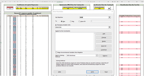
We demonstrate the usage of this sheet using a case study related to calculating the probability of a customer’s credit default as a function of three predictors: customers being students or not (X1), the amount of balance on their credit card (X2), and their income (X3). We use the publicly available data set of “default” introduced in James et al. (2014). This data set consists of 10,000 rows and four columns. Response values designated as zeros and ones have been included under the Y column. Predictors X1 (categorical), X2 (nominal), and X3 (nominal) constitute other columns of this data set. Note that the amount of income has been divided by 1,000. When analyzing this data set, we use all the classification performance measures that students have learned in previous sheets.
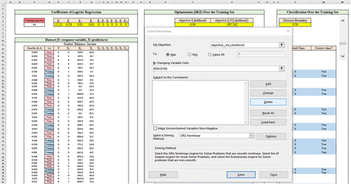
The optimized coefficients of the LoR and its maximum likelihood are printed in cells E6:O6 and E6:U6, respectively. To obtain these coefficients, the instructor can go to data → solver, in which case the panel in Figure 11 will pop out. Figure 11 shows that the objective function is of maximization type and the cells that coefficients and objective function values are printed. To find optimized coefficients, students are only required to press the “solve” button. The solver assigns the value of zero to those predictors for which no data entry has been made.
There are several detailed pedagogical points about this sheet that instructors can emphasize. Instructors can use their discretion to overemphasize or de-emphasize some of these pedagogical points based on the nature of the course and the learning objectives of the lecture. We provide an excerpt of potential learning objectives for this sheet.
Students have already learned (in the crossvalidation sheet) that the LoR model is optimized using the training set and that it is evaluated on the training (in-sample) and test (out-of-sample) sets—with more significant emphasis placed on the accuracy rate of the test set. Thus, the choice of training data set impacts the coefficients of the LoR model and hence, its accuracy on the test set. The case study sheet allows instructors and students to flexibly select the training data set by determining the value of the “training proportion” in cell C5 (see Figure 10). The instructor can set the training proportion to (for example) 0.75, in which case 75% (≈7,500 of 10,000) of the data points are randomly selected as the training set. The instructor must remind students that a random number in the range of [0, 1] has been generated and preassigned to each data point. If the assigned random number is less than or equal to the value of the “training” proportion, that data point is highlighted in blue in column D and considered as part of the training set; other data points are highlighted in pink and are a part of the test set. This interactive usage of different colors for the training and test sets allows students to understand better the impact of “training proportion” on the coefficients of the LoR model.
The instructor must elucidate the fact that the optimized LoR coefficients can be used to determine the accuracy of classification on both the training and test sets. The value of the training proportion and DB should yield similar accuracy rates in the training and test sets (i.e., avoiding overfitting). The performance of the LoR model given the value of training proportion and a DB can be evaluated on the performance measures that were discussed in previous sections (Figure 12). This sheet provides the instructor with sufficient leeway to cover all performance measures discussed in Sections 4.5 and 4.7. For instance, the instructor can set the training proportion to 0.5 and reoptimize the coefficients of the LoR model. Then, for most values of the DB, the performance of the LoR model on the training and test sets is close.
Having optimized the coefficients of the LoR model at the training proportion of 0.75 and set DB to its default value at 0.5, the instructor can mention that the accuracy of the LoR model (on the training set) is 0.9734 and ask students whether this is a good level of accuracy or not. Most students will likely respond that this level of accuracy is really high for a classifier. Once such a response is received from any student, the instructor can immediately point out that this data set contains only 333 defaulting customers with Y = 1 and 9,667 nondefaulting customers with Y = 0. Thus, for this imbalanced data set (that contains many more zeros than ones as the response variable), an accuracy of 96.67% can be easily achieved by predicting that all observations are nondefaulting ones (). Thus, the judgment regarding the classification model’s accuracy must be made in the context of the given data set.
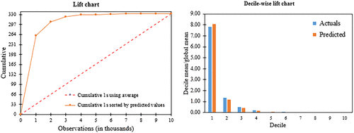
The instructor should refer students to the decile/lift charts. These two charts must be used together to demonstrate how well the LoR classifier has been able to predict response values. We expect 33.3 observations with responses Y = 1 (the diagonal red dashed line in the left panel in Figure 13) for each decile if we use the average model that has no predictive power. The use of the LoR model (at the training proportion equal to one) helps correctly classify 261 of 333 defaulting customers (78.37%) in the first decile. This shows that the LoR model gives a lift to the accuracy of the classification by the factor of eight for the first decile (the right panel in Figure 13).
Once the previous pedagogical points are covered, the instructor can re-emphasize that no performance measure must be used in a vacuum for ascertaining the performance effectiveness of a classifier. It is thus imperative that various performance measures be scrutinized concurrently and in the context of the data.

Finally, as an in-class or take-home exercise, the instructor can ask students to use linear regression with multiple predictors to perform the classification on the data set. Furthermore, the instructor can ask students to capture the interaction among predictors (i.e., , and ) on the performance of the LoR model.
5. Students’ Evaluation and Feedback
We distributed this spreadsheet model to 60 students after they had completed a lesson on logistic regression classification using Python. We asked the students to answer six questions related to the model. A total of 43 students participated in the questionnaire and provided us with their feedback (see Figure 14). The minimum, maximum, average, standard deviation, median, and mode of this questionnaire are 6, 10, 8.26, 1.076, 8, and 8, respectively. In Appendix A.4, we present the questions and include the students’ responses to each question.
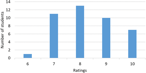
Notes. The distribution of students’ rating of the spreadsheet mode is based on 42 data points. We dropped one of the observations that was 3.96 standard deviations below the mean (i.e., 4 of 10) because no justifiable comment was provided for this score.
In what follows, we provide a summary of the general sentiments expressed by students for each question.
Q1. The quality of the spreadsheet model in facilitating learning of logistic regression and classification was highly rated. Students appreciated the interpretability, interactive visualizations, introduction of various performance metrics, and simplicity followed by deeper learning.
Q2. Students generally preferred the spreadsheet model to be presented before learning about using Python for classification. They highlighted the advantages of interactive visualizations, a better understanding of performance measures and decision boundary effects, and the intuitive nature of the spreadsheet model.
Q3. There was a mixed response to whether the instructor should use the spreadsheet model before teaching essential concepts. Some students suggested using it as an introductory example, whereas others preferred learning the basic concepts first.
Q4. Students found different sheets in the spreadsheet model interesting. The line-curve sheet, performance measure sheet, crossvalidation sheet, and likelihood sheet were mentioned, emphasizing the visualization, adjusting decision boundaries, understanding the logistic function, and exploring different model aspects.
Q5. Most students mentioned that the concepts covered in the spreadsheet model were already covered in the lectures, but they appreciated the visual illustrations, a better understanding of the comparison between linear and logistic regression, decision boundaries, likelihood, and various performance measures.
Q6. Students believed that many concepts incorporated into the spreadsheet model, such as performance metrics, decision boundaries, and model selection, are generalizable to other classification techniques, like decision trees, KNN, or neural networks.
The feedback gathered from the students indicates that they received the spreadsheet model positively and found it to be an efficient tool for comprehending essential concepts in logistic regression and classification. Additionally, the feedback highlights that each student has developed a particular interest in a specific aspect of the classification presented in the spreadsheet model. This outcome serves as a testament to the effectiveness of this spreadsheet model in promoting pedagogical strategies that incorporate visual aids and interactivity.
6. Conclusion
In this paper, we developed a comprehensive and self-contained interactive spreadsheet model that facilitates the teaching of logistic regression and classification to students in science, analytics, statistics, business, and engineering. Interactive features of this spreadsheet model allow students to play around with different parameters of the logistic regression models and by doing so, to study the notion of maximum likelihood and the impact of different classifications (e.g., by changing the DB) on different performance measures. These interactive features allow students to develop a strong understanding of classifiers’ performance measures and enable them to determine the best decision boundary that leads to the most desired performance of the logistic regression model (or other classification models). We discussed two sets of performance measures for balanced and imbalanced data sets. We further provided a multivariate logistic regression case study that helps instructors to implement such classification on new data sets. We use this case study to analyze data to illustrate that the performance measures of a classifier should be interpreted within the context of the application. Overall, our spreadsheet model will enhance students’ comprehension of maximum likelihood estimation, logistic regression, classification techniques, and model selection. The feedback collected from the student cohort reflects a positive reception toward the spreadsheet model. We can gather from the comments that they have deemed this spreadsheet model a valuable tool for comprehending fundamental concepts in logistic regression and classification. Furthermore, the feedback illuminates that each student has demonstrated an individualized interest in a particular facet of the classification elucidated within the spreadsheet model. Overall, we can conclude that the positive outcome of our survey can serve as a testament to the efficacy of this spreadsheet model in fostering pedagogical strategies that harness the power of visual aids and interactivity.
Having read through the students’ comments, we can summarize their improving recommendations for our spreadsheet model as follows.
Students highly recommended providing the spreadsheet model and relevant teaching notes prior to the first classification lecture to facilitate their learning process. They mentioned that they can read the teaching notes first and then manipulate parameters in the spreadsheet to reinforce their understanding. With due consideration to this comment, we suggest that instructors enhance before-class engagements by including up to five multiple-choice questions per sheet in the teaching notes (preferably to be responded to via the course online website), encouraging students to utilize the spreadsheet model to answer these questions. Implementing this approach will increase students’ preparedness and engagement during lectures.
Students found that visualizations greatly aided their understanding of classification and logistic regression. They suggested that the spreadsheet model’s sheets, which are not specific to logistic regression, could be easily adapted to other classification techniques, such as KNN and neural networks. Moreover, many students expressed enthusiasm for the idea of developing a similar spreadsheet model specifically for KNN (a topic that we are currently researching) and neural networks.
Students highly appreciated the “optional MLE explained” sheet, which showcases the optimization of LoR model parameters using the MLE approach and Excel Solver. This sheet was particularly valuable because the process of optimizing LoR parameters using MLE had not been extensively covered in class. A promising future direction for enhancing this spreadsheet model, as suggested by the students (in written and verbal responses), is to expand the initial single-predictor LoR model to include an example of a classification with two predictors and a binary response variable (similar to the case study sheet in our spreadsheet model that only deals with the use of Excel Solver for parameter estimation). This extension would result in the LoR function being represented as a surface in a three-dimensional space, with the decision boundary becoming an adjustable hyperplane. Such an example would provide a more comprehensive visualization of MLE for more than one predictor, enabling a clearer and more intuitive presentation of the basics of MLE in a multipredictor context. We recommend that this extension incorporates visualization features similar to those used in the sheet “big picture” presented in Erkut and Ingolfsson (2000) for optimizing the parameters of a linear regression model via the ordinary least squares technique.
We acknowledge the richness of comments we received from our colleagues Professors Gerhard Trippen and Philipp Afeche. We also thank the review team who suggested the inclusion of students’ feedback and teaching plan in the paper, which enriched the paper and attested to the usefulness of the spreadsheet model. We are grateful to the review team for the timely handling of this paper.
Appendix. Odds, MLE Details, and Students’ Evaluation Details
We review the concept of odds, its interpretation, and the MLE explained sheet that is used to optimize the coefficients of the LoR model. This sheet can be taught after the likelihood sheet discussed in Section 4.3. We assume that students are familiar with basic optimization concepts. We also include the questions and responses of students to our questions about the quality and usefulness of the spreadsheet model.
A.1. Odds
In principle, this can be addressed by simply truncating the values to the [0, 1] range: that is,
However, even this form has more fundamental issues. Linear regression assumes probabilities to be additive (i.e., every adds β1 to the probability). However, this is often not a natural assumption. For instance, consider the setting where Y is repayment of a loan (i.e., nondefault) and X is income. Although it may be natural to assume that the probability of repayment increases with income, each $10,000 in additional income is likely to have a very different impact on P(Y = 1) for someone earning $0, $50,000, or $1 million. Yet, the additive nature of the linear regression model forces the impact of the additional $10,000 in income to be the same for every X value. LoR accounts for these differential effects, as discussed.
A.2. Understanding the Interpretation of Odds and its Interpretation in LoR
A central concept to working with the LoR model is that of “odds” (i.e., a ratio of the probability that an event will happen to the probability that it does not happen). Interpreting p(X) as , we define odds as
For example, if the odds of Y = 1 are equal to two, this means that the value of one is twice as likely to occur as Y = 0. On the one hand, odds can be readily translated to probabilities by inverting the previous expression:
On the other hand, the relationship is not linear. For example, translates to . Doubling the odds to four results in , and doubling again to eight results in . Thus, doubling the odds should not be confused with doubling the probabilities. Generally, when the odds are close to zero, doubling the odds increases the probability by more than two times, whereas when odds are large, doubling the odds results in a very small increase in probability.
Based on the definition of odds, we rewrite Equation (4) as
The left-hand side of Equation (A.3) is called the log odds or logit. To get further intuition about this expression, consider the log-linear regression model
To finish the introduction of the LoR model, we turn to the interpretation of the coefficient β1. In the linear regression model (2), this coefficient represents the predicted change in Y when X changes by one unit. To obtain a similar interpretation in the LoR model, we substitute X + 1 for X in the expression for odds (A.2) to obtain
A.3. MLE Explained Sheet
In this sheet, we detail the algorithmic procedure, MLE, that is used to find optimal values for the coefficients of the LoR function: and . (After students are familiarized with calculating probability and likelihood in the “likelihood” sheet, sheet “MLE explained” integrates all previous learnings and provides a procedural framework that exposes students to the steps involved in calculating MLE.) Students previously learned that Equation (A.2) has a logit that is linear in X:
We first calculate the logit of this function that is obtainable by any combination value of β0, β1, and X. We call this value logit (). Second, we exponentiate the logit function given any combination value of β0, β1, and X to define and obtain . Now, we calculate the probability of each observation i, using formula (i.e., ). We multiply these probabilities to calculate the likelihood estimate that we then maximize as
Note that this is the same formula that we have already presented in Equation (6). Remind students that directly maximizing the equation is difficult because of the multiplicative relationship between the likelihood of different data points. Furthermore, we already observed in the dynamic stacked bar chart in the sheet “likelihoods.”
We convert this multiplicative relationship into an additive relationship that is amenable to optimization (e.g., using Excel Solver) by taking the logarithm () to get
This additive function is more amenable to optimization than the multiplicative one, and students can optimize the coefficients of β0 and β1 using the Excel Solver. Specifically, students can go to data and click on solver, in which case they will see that cell H3 (in Figure A.1) is designated as the objective function in which the value of the additive objective function is populated. The range of the objective function value of the additive model is (); values close to zero indicate a better fit of the nonlinear curve to data points. Cell B3:C3 (in Figure A.1) has been designated for the coefficients of the LoR method. Once the coefficients of the additive model are optimized, one can calculate the likelihoods of observations, multiply them together, and obtain the objective function value of the first multiplicative objective function value, which appears in cell G3.

The instructor must emphasize that MLE is a general technique and can be applied to linear regression instead of least squares. In this case, the likelihood involves using a normal distribution for and involves three parameters: β0, β1, and the unknown standard deviation of errors s2. Interestingly, under this normal assumption, the MLE and the least squares methods for linear regression give the same closed-form solution. However, if the error term has a different distribution, the MLE method may not have a closed-form solution.
A.4. Details of Students’ Feedback
We include a few responses from students provided for each question right after the question.
We include some of the students’ answers to Q1 as follows.
Q1. From 1 to 10, how do you rank the quality of the spreadsheet model in facilitating your learning of logistic regression and classification?
— “I would rate the quality of the spreadsheet to be 9. I really liked the quality of the spreadsheet model, and it was really interpretable even before going through the teacher’s notes.”
— “I will give it 10 out of 10. The spreadsheet model uses interactive visualizations to explain how changing parameters and decision boundaries can affect model fitting and performance metrics. The spreadsheet also distinguishes probability and likelihood and introduces various performance metrics other than accuracy. The confusion matrix is also very useful in logistic regression.”
— “I will rank this spreadsheet at 9. It starts with a very simple example of classifying whether the [balance] determines the [default status] of the customer. It is very educating, starting with something simple but teaching something deep.”
— “I would rank the quality of the spreadsheet in helping to learn logistic regression and classification to be 7. I believe that the interactive graph with the data are very helpful to visualize what both classification and logistic regression look like on a high level; however, I believe there lacks some more theoretical understanding of how the decision boundary works.”
— “I would rank the quality of this spreadsheet as 9 out of 10. I think it is a great spreadsheet model that breaks down how logistic regression coefficients are identified through MLE and provides a good overview of different classification metrics. I like how it is interactive so that the student can see how changing parameters impact the model. In general, I felt that the use of spreadsheet models helped me understand different machine learning algorithms in RSM8413 as it allowed me to walk through the algorithms (even if they were simplified) step by step.”
— “8 out of 10. This spreadsheet model is quite user-friendly. This model allows for a hands-on learning experience, which can help to reinforce understanding of the underlying concepts. The model also includes clear explanations and visualizations, which make it easier to understand the key concepts involved in logistic regression and classification. It includes all aspects of logistic regression, including how decision boundaries could affect the resulting binary categorization, how to measure the performance of the model, the performance comparison between logistic regression and linear regression, crossvalidation for overfitting check, and a case study.”
Q2. Would you prefer this spreadsheet model to have been presented to you before you learned about how to use Python to perform classification using logistic regression?
— “Yes, I would prefer this spreadsheet model to be presented before learning classification using logistic regression in Python. However, I would like to get some academic background through the textbook before diving deep into the spreadsheet model.”
— “Yes. Implementing a logistic regression model in Python is not an interactive process and we won’t be able to tell how changing the parameters and decision boundary will impact the model. The interactive visualizations in the spreadsheet model can better illustrate the effect.”
— “Yes. I would like to have this presented to me. Instead of looking at code, which is not very intuitive, the spreadsheet provides a very vivid example of how to use logistic regression in a classification problem.”
— “I would like that the spreadsheet model to be presented to me first to give me a general overview without needing to worry about all the Python code and the debugging process associated with performing classification utilizing logistic regression in Python if I did not possess a technical background.”
— “I would prefer it to be introduced before I learned about the specific Python code related to logistic regression, as the dynamic nature of the spreadsheet model could help me to better understand the logistic regression model from a visual and graphical perspective. By seeing how the input variables and decision boundaries affect the predicted outcomes, I could gain a more intuitive understanding of how logistic regression works, which could help me in learning the code and design the model.”
— “In general, excel is always a better format to initially learn the details of an algorithm before coding or demonstrating in Python. Everything in Python happens under the hood, hence Excel gives some better intuition as to what is happening under the hood. Therefore, yes.”
— “I did enjoy how I can instantly observe the changes in the models when adjusting parameters. This would be a great tool to introduce the concept of classification using logistic regression.”
Q3. Do you suggest that the instructor use this spreadsheet model before teaching you essential concepts in classification using logistic regression?
— “I would prefer to see the spreadsheet before getting into programming in Python.”
— “I would suggest the instructor use this spreadsheet model to teach the students the essential concepts in classification using logistic regression. The spreadsheet model already contained detailed concepts of logistic regression. By elaborating on each sheet about the statistical concept behind the model, the students will better understand the logistic regression.”
— “Yes. It would be great to serve as an introductory example of the classification problem.”
— “Absolutely. It’s comprehensive but still needs some clarifications for those graphs and terminologies.”
— “No, I would prefer to learn the basic concepts of logistic regression before getting into the spreadsheet. However, I would prefer to see the spreadsheet before getting into programming in Python.”
Q4. Which sheet in the spreadsheet model is of particular interest to you? Why?
— “I really liked the line-curve sheet of the model. I liked it because it helped me visualize how the line fit changes with the change in coefficient values and how it looks when the coefficients are optimized. It would have been great to have this along with learning the concepts of logistic regression.”
— “I am particularly interested in the performance measure sheet. After doing various projects, I understand that accuracy/precision should not be the only metric that a data analyst familiars. Given the context of the project, students need to be able to adjust the decision boundary and use various performance metrics to interpret the model. For example, when determining the risk of fraud, the bank wants to sacrifice accuracy for recall because FN will have bigger losses than FP.”
— “The crossvalidation sheet. It has an interactive bar that can change the value of the decision boundary. The boundary line on the chart and the results of classification will change accordingly. The comparison between logistic regression and simple linear regression is also changed. It is very vivid and user-friendly so I can see how different decision boundaries will affect the results.”
— “The sheet of “likelihood” appeals to me most because that’s the rationale behind the idea of the logistic function, and many people are confused about probability and likelihood. It would be better if there are more clarifications between these two concepts.”
— “The decision boundary function is another good visual representation of a concept that can be challenging for learners.”
— “The MLE sheet interested me the most. Typically we are told that we don’t need to know the details of MLE. It was nice to see the full calculations.”
— “‘Decision Boundary’ and ‘Performance measures’ since by working with these two sheets, I can observe how changes in the input variables and decision boundaries affect the resulting binary categorization, as well as the performance of the model.”
— “The model selection part is very interesting. I would want to learn more about how to compare various models referring to various indicators. For example, how does ROC affect our decision?”
— “Personally, I found the line curve and log likelihood the most helpful to understand exactly why this model is even needed and why a linear regression cannot be used. It summarizes the need for logistic regression really well while also visually explaining the problem with real data.”
— “I particularly enjoy the performance measures sheet. It is easy to adjust and understand. The performance measures and status explain the important concepts of understanding the logistic regression model. A vertical line to explain the predicted class would help aid in the visualization of the actual decision in the display would be nice though.”
— “Performance measures. I believe we haven’t learned this in the previous lecture. The new terms like F beta score, and performance measure for imbalanced data sets are not taught before, and I learned new from this spreadsheet. Performance measures are important when the data provided is not balanced because accuracy alone can be misleading.”
Q5. What classification concept did you learn in this spreadsheet model that was nonexistent in your classification lecture? Or which concepts did you understand better after working on this spreadsheet model?
— “I was already aware of the concepts as they were taught in the tools term courses. However, it was good to see the line-curve sheet and visualize how the residuals are minimized by changing the coefficients.”
— “Given the background of the program, the majority of the concepts have been covered during lectures. But I still find the illustration of how beta0 and beta1 can affect the model shape interesting. Beta0 controls the up-and-down panning while beta1 controls the slope of the curve around the center.”
— “I understand better the comparison between linear regression and logistic regression. By providing the comparison directly both graphically and mathematically, I better understand that why we should choose logistic regression over linear regression for classification problems.”
— “It’s interesting to see how the output changes when adjusting the decision boundary bar in the sheet of the decision boundary.”
— “Understanding how MLE and likelihood work a bit better due to the slider and visualization associated with that spreadsheet.”
— “I feel that I am biased because I have already learnt about most of the classification metrics during the tools term. However, the performance measures give a good overview of the different types of performance metrics that could be used and shows how certain metrics are higher than others, which puts an emphasis on understanding what the model is trying to detect and using that specific metric to evaluate your model.”
— “I got a better understanding of lift charts used for logistic regressions. Seeing the data and the graphs was helpful.”
— “I understand better the concept of decision boundaries and how they can be used to separate binary classes in logistic regression and the comparison between logistic regression and linear regression, and why logistic regression is more appropriate for binary classification tasks with the aid of visualization and dynamic graphs.”
— “Log likelihood—explained better in here whereas I feel it was brushed through in lecture content. Hence, this spreadsheet provides a good resource to understand this concept better.”
— “I don’t quite remember learning about F1 and F2 scores. However, the sheet did a great way explaining the math and measures of the specific logistic regression displayed.”
Q6. To what extent do you think the concepts incorporated into this spreadsheet model are generalizable to other classification techniques?
— “One of the most common knowledge in the classification model is the performance metric. I think the spreadsheet model spends lots of effort in thoroughly explaining the details of all the metrics. This knowledge will be easily generalized to other classification techniques like decision trees, KNN, or neural networks.”
— “Other classification techniques like KNN can use this spreadsheet as a starting point. Because KNN method can also be visualized in Excel and we can easily see how the results change by changing the value of k.”
— “Understanding the decision boundary, performance measures, and model selection the spreadsheet is generalizable as they go over key concepts that are seen with all machine learning algorithms and classification problems.”
— “I think a K-nearest neighbors version of this would also be really helpful for a lot of students.”
— “I think the performance metrics, model selection, and crossvalidation concepts are generalizable to other classification techniques and feel that those sheets could be replicated for different classification techniques.”
— “While the spreadsheet model specifically focuses on logistic regression, many of the concepts that it covers are applicable to other classification techniques as well. For example, the concept of overfitting and the use of crossvalidation to address it are relevant to many other machine learning models. Additionally, the idea of decision boundaries and feature selection are important considerations in many classification tasks, regardless of the specific modeling approach being used. I think it is an effective way to enhance student’s learning experience and improve their understanding of complex concepts by using interactive tools to supplement traditional classroom materials.”
— “The spreadsheet model is very generalizable, lots of classification model involves choosing proper decision boundary to optimize accuracy and compare models.”
— “I think very generalizable. I see a lot of topics discussed in this spreadsheet that are clearly applicable to other algorithms we learned and other classification problems we faced. For example, neural network classification problems can sometimes also use the sigmoid function. Crossvalidation is another generalizable concept. The idea of a decision boundary is relevant in any classification problem. Hence, very generalizable.”
— “I would think that the basic concepts of classification like performance, choice of betas, decision boundary, performance measures, model selection, and crossvalidation are relevant concepts that are implemented in other classification techniques.”
1 The constructive alignment approach is an instructional design framework that aims to align the intended learning outcomes, teaching and learning activities, and assessment methods in a coherent and purposeful manner.
2 Readers are referred to section 6 in Hoang and Watson (2022) for shortcomings of existing Excel add-ins for logistic regression.
3 We have developed an MLE technique for a single-predictor LoR model in comparison with the paper by Brusco (2022), which developed an MLE technique for an LoR model with multiple predictors.
4 We note that our model selection is only done between the linear regression and the LoR models based primarily on the accuracy measure of the final results. This is in contrast to the model selection discussed by Brusco (2022), which is focused on the selection of predictor variables using either “all possible subsets” or “lasso” methods.
5 We cover sheets (a)–(h) in a two-hour lecture and sheet (i) in another hour. We believe that the teaching of all sheets is necessary for the development of a deep understanding of the LoR model and classification techniques for students who major in analytics. Instructors should use their discretion in choosing the teaching material depending on their learning objectives.
6 As is common, we use the MLE method to find the values of model parameters β0 and β1.
7 If when , the denominator becomes very large, and thus, the value of p(X)in (4) would tend to zero; similarly, when , the exponential term becomes very small, the denominator approaches one, and thus, the prediction would tend to one. Of course, if , these trends are reversed; as and as . Finally, if , the value of X has no impact on p(X) at all.
8 These optimized parameters have already been obtained via the OLS technique. See Erkut and Ingolfsson (2000) for an interactive use of OLS to optimize coefficients of a linear regression model.
9 These two functions accept two vectors of data Y and X to determine the value of the intercept and slope.
10 The instructor must note that the stacked bar used to determine the accuracy differs from the stacked bar used in the sheet likelihood to illustrate the amount of MLE.
11 More on this subject is covered in the case study sheet.
12 In the model selection sheet, we do not include performance measures suited for imbalanced data sets because our small data set is balanced. We discuss all performance measures in the case study sheet where our large data set is imbalanced.
13 There are many ways to crossvalidate a model. We do not review these.
References
- (2023) Introducing and integrating machine learning in an operations research curriculum: An application-driven course. INFORMS Trans. Ed. 23(2):64–83.Link, Google Scholar
- (2022) Logistic regression via Excel spreadsheets: Mechanics, model selection, and relative predictor importance. INFORMS Trans. Ed. 23(1):1–11.Link, Google Scholar
- (2019) Competitive facility location with selfish users and queues. Oper. Res. 67(2):479–497.Abstract, Google Scholar
Developers Google (2022) Machine learning, foundational courses, imbalanced data. Accessed March 6, 2023, https://developers.google.com/machine-learning/data-prep/construct/sampling-splitting/imbalanced-data#:∼:text=A\%20classification\%20data\%20set\%20with,smaller\%20proportion\%20are\%20minority\%20classes.Google Scholar- Diamant A (2023) Introducing prescriptive and predictive analytics to MBA students with Microsoft Excel. INFORMS Trans. Ed., ePub ahead of print May 4, https://doi.org/10.1287/ited.2023.0286.Google Scholar
- (2000) Let’s put the squares in least-squares. INFORMS Trans. Ed. 1(1):47–50.Link, Google Scholar
- (2022) Teaching binary logistic regression modeling in an introductory business analytics course. Decision Sci. J. Innovative Ed. 20(4):201–211.Crossref, Google Scholar
- (2020) Case article-converting NFL point spreads into probabilities: A case study for teaching business analytics. INFORMS Trans. Ed. 21(1):57–60.Google Scholar
- (2014) An Introduction to Statistical Learning: With Applications in R (Springer Publishing Company, New York).Google Scholar
- (2020) Online risk monitoring using offline simulation. INFORMS J. Comput. 32(2):356–375.Abstract, Google Scholar
- (2019) Optimizing the multistage university admission decision process. INFORMS J. Appl. Analytics 49(6):422–429.Link, Google Scholar
- (2018) Case article-business value in integrating predictive and prescriptive analytics models. INFORMS Trans. Ed. 19(1):36–42.Google Scholar
- (2009) Helping men decide about scheduling a prostate cancer screening exam. Interfaces 39(3):209–217.Link, Google Scholar
- (2019) Regressit: Free add-in for linear and logistic regression in excel and r. INFORMS Open Forum (July 11), https://connect.informs.org/communities/community-home/digestviewer/viewthread?MessageKey=28827862-867e-4546-b220-41a4f88bee64&CommunityKey=1d5653fa-85c8-46b3-8176-869b140e5e3c&tab=digestviewer.Google Scholar